One of the biggest challenges facing new Codename One developers is the challenge of creating an elegant looking UI. This isn’t trivial in any tool but we don’t make it easy enough in some cases. In the tutorial below I’m focusing on one of the most important UI elements: the side menu.
I chose to use a very simple design so this will be easy to follow, you can easily build on top of this to create highly customized styles.
The code from the video above is below, you can check out the full repository on github.
The Side Menu
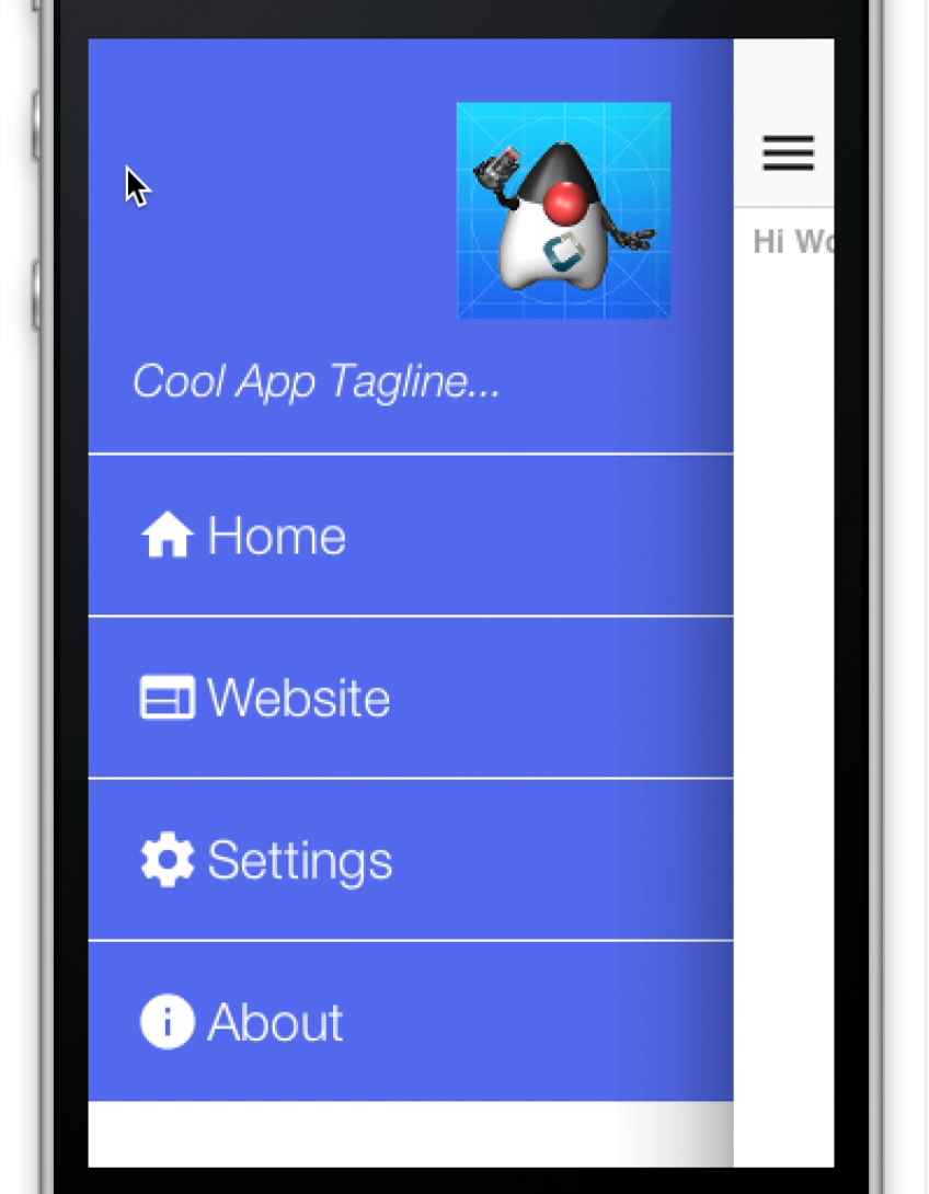
Figure 1. Side Menu final result
A side menu is a crucial piece of an elegant application. I’ll explain how one creates a simple side menu that’s elegant, portable and easy to build. This is a good “starting point” side menu from which you can build more elaborate designs.
To get this result we will start from a native theme and a bare bones application to keep things simple.
The code for the side menu is this:
Form hi = new Form("Hi World");

Toolbar tb = hi.getToolbar();
Image icon = theme.getImage("icon.png"); __**(1)**
Container topBar = BorderLayout.east(new Label(icon));
topBar.add(BorderLayout.SOUTH, new Label("Cool App Tagline...", "SidemenuTagline")); __**(2)**
topBar.setUIID("SideCommand");
tb.addComponentToSideMenu(topBar);

tb.addMaterialCommandToSideMenu("Home", FontImage.MATERIAL_HOME, e -> {}); __**(3)**
tb.addMaterialCommandToSideMenu("Website", FontImage.MATERIAL_WEB, e -> {});
tb.addMaterialCommandToSideMenu("Settings", FontImage.MATERIAL_SETTINGS, e -> {});
tb.addMaterialCommandToSideMenu("About", FontImage.MATERIAL_INFO, e -> {});

hi.addComponent(new Label("Hi World"));
hi.show();
| __1 | This is the icon which was used in lieu of a logo it appears in the top right of the side menu |
|---|---|
| __2 | This is the top bar containing the tagline and the icon it’s styled as if it’s a command but you can put anything here e.g. an image etc. |
| __3 | The commands are added as usual to the side menu with no styling or functionality, the entire look is determined by the theme |
Next we’ll open the designer tool to style the UI
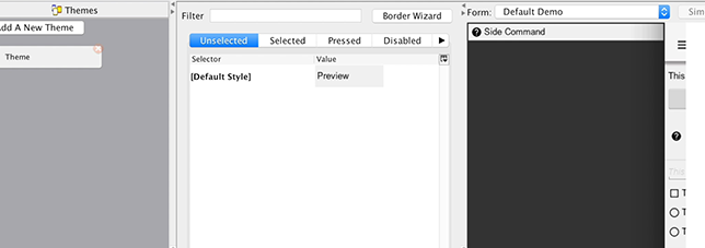
Figure 2. Open the side menu so we will get the right values in the combo box on add
Now when we press Add the side menu entries will appear in the combo box (you can type them but this is more convenient). We’ll start with the SideNavigationPanel style:
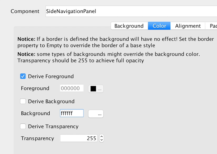
Figure 3. The SideNavigationPanel has an opaque white background
The SideCommand style is a bit more elaborate, we start with a white foreground and an opaque bluish/purple color:
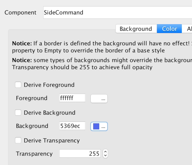
Figure 4. The SideCommand has a white foreground and opaque bluish background
We’ll set padding to 3 millimeters which gives everything a good feel and spacing. This is important for finger touch sensitivity.
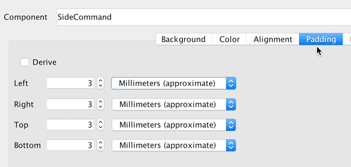
Figure 5. Padding is 3mm so it will feel spacious and touch friendly
We’ll set margin to 0 except for the bottom one pixel which will leave a nice white line by showing off the background. This means the commands will have a space between them and the white style we gave to the SideNavigationPanel will appear thru that space.
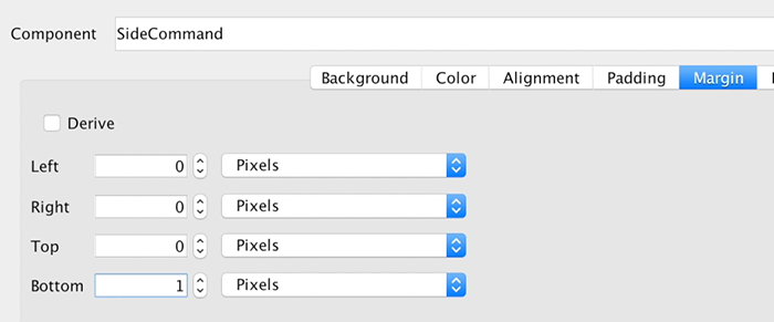
Figure 6. Margin is 0 except for a thin line below each command
Setting the border to empty is crucial!
The iOS version of the side command inherits a border style so we must “remove” it by defining a different border in this case an empty border. Since borders take precedence over color this would have prevented the color changes we made from appearing.
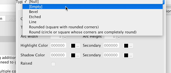
Figure 7. Border must be defined as Empty
Next we need to pick a good looking font and make sure it’s large enough. We use millimeters to size it correctly for all OS’s and override the derived text decoration which has a value in the iOS native theme so it can impact the final look.
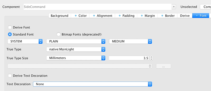
Figure 8. Pick a good looking font for the side command
Next we need to move to the selected tab and add a new side command entry that derives from the unselected version. We’ll pick a new color that’s slightly deeper and will make the selected style appear selected. We’ll also copy and paste this selected style to the pressed style.
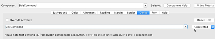
Figure 9. Selected & Pressed SideCommand
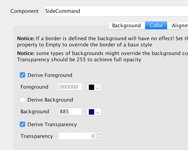
Figure 10. Color for the Selected/Pressed SideCommand
The SidemenuTagline is just a SideCommand style that was slightly adapted. We’ll remove the padding and margin because the whole section is wrapped in a side command and we don’t want double padding. We’ll leave 1mm padding at the top for a bit of spacing from the logo.
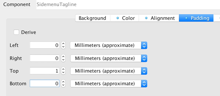
Figure 11. Padding of the SidemenuTagline
We’ll also update the font to a smaller size and italic styling so it will feel like a tagline.
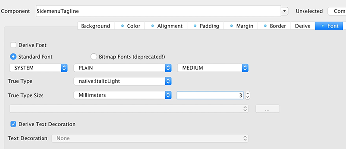
Figure 12. Font for the SideMenuTagline is slightly smaller and italic
The last change for the theme is for the StatusBarSideMenu UIID which is a spacing on the top of the sidemenu. This spacing is there for iOS devices which render the clock/battery/reception symbols on top of the app. We’ll set the padding to 0.
Figure 13. StatusBarSideMenu padding for the top of the side menu
Finally, we’ll add the icon image (or a logo if you have it) into the theme as a multi image so we can use it within the side menu as a good looking logo. A relatively large icon image works as a 2HD multi-image but you can use many strategies to get a fitting image for this spot.
| __ | Rounded images work well here, you can round images dynamically using masking |
|---|
These steps produce the UI above as a side menu, they might seem like a long set of steps but each step is pretty simple as you walk thru each one. This does show off the versatility and power of Codename One as a change to one step can create a radically different UI design.
Final Word
This is my first tutorial installment and I hope you enjoy it, be sure to leave feedback/thoughts/questions as I’d like to create more tutorials like this moving forward.
I would like to focus extensively on UI design/layout as it seems to be a stumbling point for many Codename One developers.
Archived Comments
This post was automatically migrated from the legacy Codename One blog. The original comments are preserved below for historical context. New discussion happens in the Discussion section.
Carlos — May 12, 2017 at 12:07 pm (permalink)
Great!!
It would be awesome if the hamburger icon could morph into a back arrow, like most apps do.
And would be even better if the side panel could open on top.
Shai Almog — May 13, 2017 at 5:33 am (permalink)
Thanks, we already implemented an on-top side menu (although it’s experimental) it’s been in the repo for 2 weeks by now but I didn’t get around to blogging about it. Will do that next week. The icon animations is something I’d like but it’s not trivial to do that right
Kerllon Andrade — November 20, 2018 at 4:06 pm (permalink)
Is css?
Shai Almog — November 21, 2018 at 7:08 am (permalink)
No.
Discussion
Join the conversation via GitHub Discussions.