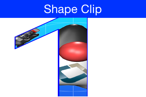
Clipping is one of the core tenets of graphics programming, you define the boundaries for drawing and when
you exceed said boundaries things aren’t drawn. Shape clipping allows us to clip based on any arbitrary Shape
and not just a rectangle, this allows some unique effects generated in runtime.
E.g. this code allows us to draw the image on the top of this post:
Image duke = null;
try {
    // duke.png is just the default Codename One icon copied into place
    duke = Image.createImage("/duke.png");
} catch(IOException err) {
    Log.e(err);
}
final Image finalDuke = duke;

Form hi = new Form("Shape Clip");

// We create a 50 x 100 shape, this is arbitrary since we can scale it easily
GeneralPath path = new GeneralPath();
path.moveTo(20,0);
path.lineTo(30, 0);
path.lineTo(30, 100);
path.lineTo(20, 100);
path.lineTo(20, 15);
path.lineTo(5, 40);
path.lineTo(5, 25);
path.lineTo(20,0);

Stroke stroke = new Stroke(0.5f, Stroke.CAP_ROUND, Stroke.JOIN_ROUND, 4);
hi.getContentPane().getUnselectedStyle().setBgPainter((Graphics g, Rectangle rect) -> {
    g.setColor(0xff);
    float widthRatio = ((float)rect.getWidth()) / 50f;
    float heightRatio = ((float)rect.getHeight()) / 100f;
    g.scale(widthRatio, heightRatio);
    g.translate((int)(((float)rect.getX()) / widthRatio), (int)(((float)rect.getY()) / heightRatio));
    g.setClip(path);
    g.setAntiAliased(true);
    g.drawImage(finalDuke, 0, 0, 50, 100);
    g.setClip(path.getBounds());
    g.drawShape(path, stroke);
    g.translate(-(int)(((float)rect.getX()) / widthRatio), -(int)(((float)rect.getY()) / heightRatio));
    g.resetAffine();
});

hi.show();
| __ | The original publication of this code was missing the second translate call which might have some on-device issues |
|---|
__ | Notice that this functionality isn’t available on all platforms so you normally need to test if shaped clipping is
| supported using isShapeClipSupported(). |
|---|
Bubble Transition
One of the reasons for adding shaped clipping is the new
BubbleTransiton class.
It’s a transition that morphs a component into another component using a circular growth motion.
The BubbleTransition accepts the component that will grow into the bubble effect as one of its arguments. It’s generally
designed for Dialog transitions although it could work for more creative use cases:
| __ | The code below manipulates styles and look. This is done to make the code more “self contained”. Real world code should probably use the theme |
|---|
Form hi = new Form("Bubble");
Button showBubble = new Button("+");
showBubble.setName("BubbleButton");
Style buttonStyle = showBubble.getAllStyles();
buttonStyle.setBorder(Border.createEmpty());
buttonStyle.setFgColor(0xffffff);
buttonStyle.setBgPainter((g, rect) -> {
    g.setColor(0xff);
    int actualWidth = rect.getWidth();
    int actualHeight = rect.getHeight();
    int xPos, yPos;
    int size;
    if(actualWidth > actualHeight) {
        yPos = rect.getY();
        xPos = rect.getX() + (actualWidth - actualHeight) / 2;
        size = actualHeight;
    } else {
        yPos = rect.getY() + (actualHeight - actualWidth) / 2;
        xPos = rect.getX();
        size = actualWidth;
    }
    g.setAntiAliased(true);
    g.fillArc(xPos, yPos, size, size, 0, 360);
});
hi.add(showBubble);
hi.setTintColor(0);
showBubble.addActionListener((e) -> {
    Dialog dlg = new Dialog("Bubbled");
    dlg.setLayout(new BorderLayout());
    SpanLabel sl = new SpanLabel("This dialog should appear with a bubble transition from the button", "DialogBody");
    sl.getTextUnselectedStyle().setFgColor(0xffffff);
    dlg.add(BorderLayout.CENTER, sl);
    dlg.setTransitionInAnimator(new BubbleTransition(500, "BubbleButton"));
    dlg.setTransitionOutAnimator(new BubbleTransition(500, "BubbleButton"));
    dlg.setDisposeWhenPointerOutOfBounds(true);
    dlg.getTitleStyle().setFgColor(0xffffff);

    Style dlgStyle = dlg.getDialogStyle();
    dlgStyle.setBorder(Border.createEmpty());
    dlgStyle.setBgColor(0xff);
    dlgStyle.setBgTransparency(0xff);
    dlg.showPacked(BorderLayout.NORTH, true);
});

hi.show();
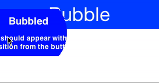
Figure 1. Bubble transition converting a circular button to a Dialog
Archived Comments
This post was automatically migrated from the legacy Codename One blog. The original comments are preserved below for historical context. New discussion happens in the Discussion section.
java_dev — March 23, 2016 at 9:53 am (permalink)
Is this feature released in eclipse plugin?
Shai Almog — March 24, 2016 at 3:29 am (permalink)
Shai Almog says:
This is part of the library not the plugin core. Libraries get updated every Friday since last Friday.
So it’s already in although we made some improvements to the implementation which will go in this Friday. To get this just use “Update Client Libs” in the Codename One section in the preferences.
Javier Anton — May 21, 2020 at 10:15 am (permalink)
Javier Anton says:
A brief flicker around the dialog’s content is shown when the dialog background is set to transparent.
Edit: solved by extending BubbleTransition and setting the transparency within
Shai Almog — May 22, 2020 at 4:08 am (permalink)
Shai Almog says:
If you can see a bug in the code feel free to submit a pull request.
Discussion
Join the conversation via GitHub Discussions.