Circles and completely round border sides are problematic for multi-resolutions. You need to draw them dynamically
and can’t use image borders which can’t be tiled/cut to fit round designs. Up until now we recommended using
background images or changing the design entirely but now we have a new option: RoundBorder.
We designed the RoundBorder to enable two distinct types of borders:
Circular borders – e.g. Android floating action
Rectangles with round (not rounded) sides
Notice that this border doesn’t address the case of rounded corner border.
Currently we don’t have a way to define this border from the theme and we are still ironing out all the features
that will go into it but we already have the basic underpinnings.
Border Builder
A round border is created using the builder pattern. You can get a new instance using RoundBorder.create(),
this will produce a red circular border with no shadow or stroke. You can then chain operations together to produce
various effects e.g. this is our starting point:
Form hi = new Form("Round", new BorderLayout(BorderLayout.CENTER_BEHAVIOR_CENTER));
Label l = new Label("X");
l.getUnselectedStyle().setAlignment(Component.CENTER);
l.getUnselectedStyle().setBorder(
        RoundBorder.create()
);
hi.add(BorderLayout.CENTER, l);
hi.show();

Figure 1. Plain round border with no options
We can set the color:
RoundBorder.create().color(0xff)

Figure 2. Round border with blue color
We can change the opacity:
RoundBorder.create().color(0xff).opacity(100)

Figure 3. Round border with blue color and transparency
Border can have drop shadows, however since they increase the size required for the border we also added
some padding to the code:
Form hi = new Form("Round", new BorderLayout(BorderLayout.CENTER_BEHAVIOR_CENTER));
Label l = new Label("X");
l.getUnselectedStyle().setAlignment(Component.CENTER);
l.getUnselectedStyle().setPaddingUnit(Style.UNIT_TYPE_DIPS);
l.getUnselectedStyle().setPadding(5, 5, 5, 5);
l.getUnselectedStyle().setBorder(
        RoundBorder.create().shadowOpacity(90)
);
hi.add(BorderLayout.CENTER, l);
hi.show();

Figure 4. Round border with dropshadow
You can control the shadow spread (how big it is), its opacity, blur & x/y position (to create light source perspective).
So if we want a slightly larger shadow from a light source coming from the top right we can do something like this:
l.getUnselectedStyle().setPadding(3, 8, 8, 3);
l.getUnselectedStyle().setBorder(
        RoundBorder.create().shadowOpacity(90).
                shadowSpread(Display.getInstance().convertToPixels(4)).
                shadowX(1).
                shadowY(0)
);
__ | Notice that we had to change the padding so the X will remain the center as the border is now larger on the
| bottom left sides due to the shadow. |
|---|
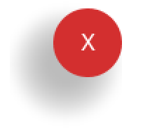
Figure 5. Larger dropshadow that is cast to the bottom left
Round borders can also be used for more rectangular shapes such as this:
Label l = new Label("Label Text");
l.getUnselectedStyle().setAlignment(Component.CENTER);
l.getUnselectedStyle().setBorder(
        RoundBorder.create().rectangle(true)
);

Figure 6. Rectangle mode in the round border
We can even stroke round borders with a line around the edges & all of the operations work on circles/rectangles etc!
To stroke we need to define the Stroke object and can optionally define color/opacity for the stroke:
RoundBorder.create().rectangle(true).stroke(new Stroke(2, Stroke.CAP_SQUARE, Stroke.JOIN_MITER, 4)).
        strokeColor(0xff).strokeOpacity(120)
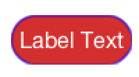
Figure 7. Stroked round rectangle
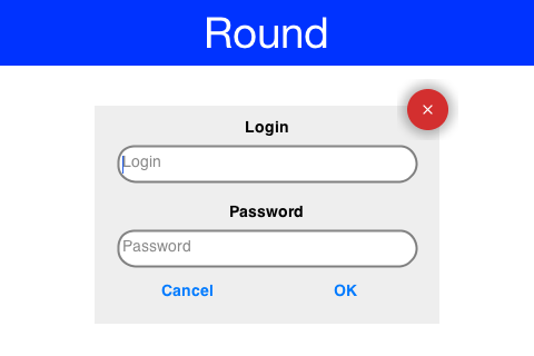
Putting it all Together
The sample below puts all of these features together into a single UI that works well in portrait/landscape and
all DPI’s. We chose to use hardcoded style settings so the sample will be self contained:
Form hi = new Form("Round", new BorderLayout(BorderLayout.CENTER_BEHAVIOR_CENTER));

Button ok = new Button("OK");
Button cancel = new Button("Cancel");

Label loginLabel = new Label("Login", "Container");
loginLabel.getAllStyles().setAlignment(Component.CENTER);

Label passwordLabel = new Label("Password", "Container");
passwordLabel.getAllStyles().setAlignment(Component.CENTER);

TextField login = new TextField("", "Login", 20, TextArea.ANY);
TextField password = new TextField("", "Password", 20, TextArea.PASSWORD);
Style loginStyle = login.getAllStyles();
Stroke borderStroke = new Stroke(2, Stroke.CAP_SQUARE, Stroke.JOIN_MITER, 1);
loginStyle.setBorder(RoundBorder.create().
        rectangle(true).
        color(0xffffff).
        strokeColor(0).
        strokeOpacity(120).
        stroke(borderStroke));
loginStyle.setMarginUnit(Style.UNIT_TYPE_DIPS);
loginStyle.setMargin(Component.BOTTOM, 3);
Style passwordStyle = password.getAllStyles();
passwordStyle.setBorder(RoundBorder.create().
        rectangle(true).
        color(0xffffff).
        strokeColor(0).
        strokeOpacity(120).
        stroke(borderStroke));


Container box = BoxLayout.encloseY(
        loginLabel,
        login,
        passwordLabel,
        password,
            GridLayout.encloseIn(2, cancel, ok));

Button closeButton = new Button();
Style closeStyle = closeButton.getAllStyles();
closeStyle.setFgColor(0xffffff);
closeStyle.setBgTransparency(0);
closeStyle.setPaddingUnit(Style.UNIT_TYPE_DIPS);
closeStyle.setPadding(3, 3, 3, 3);
closeStyle.setBorder(RoundBorder.create().shadowOpacity(100));
FontImage.setMaterialIcon(closeButton, FontImage.MATERIAL_CLOSE);

Container layers = LayeredLayout.encloseIn(box, FlowLayout.encloseRight(closeButton));
Style boxStyle = box.getUnselectedStyle();
boxStyle.setBgTransparency(255);
boxStyle.setBgColor(0xeeeeee);
boxStyle.setMarginUnit(Style.UNIT_TYPE_DIPS);
boxStyle.setPaddingUnit(Style.UNIT_TYPE_DIPS);
boxStyle.setMargin(4, 3, 3, 3);
boxStyle.setPadding(2, 2, 2, 2);

hi.add(BorderLayout.CENTER, layers);

hi.show();
Figure 8. Sample containing round border variants
Archived Comments
This post was automatically migrated from the legacy Codename One blog. The original comments are preserved below for historical context. New discussion happens in the Discussion section.
Yaakov Gesher — September 14, 2016 at 6:01 am (permalink)
This looks great! Is there a Material Design theme available/in the works?
Shai Almog — September 15, 2016 at 3:43 am (permalink)
Thanks, we are working on bringing material design concepts into Codename One. E.g. yesterdays floating button post.
Most of those concepts don’t really fit into the idea of a “theme” but rather widgets… If you have a specific thought or something else you want from material design let us know.
Chibuike Mba — September 16, 2016 at 7:36 pm (permalink)
Nice one Shai. Good job.
Discussion
Join the conversation via GitHub Discussions.