One of our enterprise accounts was using lead component in a rather unique setting and needed a way to “unlead” essentially disable the lead component functionality which is one of those things we never imagined people doing. As a result we allowed setLeadComponent(null) to effectively “do the right thing” for most cases.
This reminded me that lead component is something that we definitely need to cover again, the developer guide barely touches the subject that is one of the most powerful concepts we have.
Codename One has two basic ways to create new components:
1. Subclass a component override paint, implement key handling etc.
2. Composite multiple components into a new component, usually by subclassing a container.
As Codename One matures we find ourselves doing less of option 1 and a lot more of option 2. You can look at components like Tabs which make a lot of sense as a Container since they contain other components. However, components like MultiButton, SpanButton & SpanLabel don’t necessarily seem like the right candidate for that but they are…
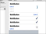
Using a Container allows us a lot of flexibility in terms of layout & functionality for a specific component. MultiButton is a great example of that. It’s internally a Container that contains 5 labels and a Button (that might be replaced with a check box or radio button).
So how do we make the MultiButton “feel” like a single button?
Simple, we use setLeadComponent() which turns the button (or radio/checkbox) into the “leader” of the component.
When a Container hierarchy is placed under a leader all events within the hierarchy are sent to the leader, so if a label within the lead component receives a pointer pressed event this event will really be sent to the leader. E.g. in the case of the multi button the button will receive that event and send the action performed event, change the state etc.
The leader also determines the style state, so all the elements being lead are in the same state. E.g. if the button is pressed all elements will display their pressed states, notice that they will do so with their own styles but they will each pick the pressed version of that style so a Label UIID within a lead component in the pressed state would return the Pressed state for a Label not for the Button.
This is very convenient when you need to construct more elaborate UI’s and the cool thing about it is that you can do this entirely in the designer which allows assembling containers and defining the lead component inside the hierarchy.
Notice: This post was automatically converted using a script from an older blogging system. Some elements might not have come out as intended…. If that is the case please let us know via the comments section below.
Archived Comments
This post was automatically migrated from the legacy Codename One blog. The original comments are preserved below for historical context. New discussion happens in the Discussion section.
Anonymous — April 5, 2014 at 3:41 pm (permalink)
Anonymous says:
Could you elaborate a bit more on the last paragraph – creating a complex component from within the designer.
You can’t subclass a container in the designer, right? So one should simply use a basic container, layout whatever component is needed, and then set one of them as the leader? If so, can you then reuse this component in multiple places, multiple forms? If so, then it’s really cool! Well, even if it’s not quite like I described, it’s still pretty powerful!
Anonymous — April 6, 2014 at 3:38 am (permalink)
Anonymous says:
Sure, when you create a Container in the designer (not a form) it will appear as part of the User Components within other forms and you can drag it as a whole into new locations.
Notice that this will create a copy so changes to the original will not be reflected.
You can also use crateContainer from code to create a container instance thus populate the UI from elements created in the designer. Thanks to lead component you don’t really need to subclass in order to create a completely new component. The main reason we subclassed to create multi-button etc. was so the API will be “pretty”.
Discussion
Join the conversation via GitHub Discussions.