We’ve been very busy the past few weeks despite the summer time but August is always problematic, I will personally take some time off from the blog next week and near the end of August. To allow that I want to clear my table from a lot of the features that went into Codename One over the past couple of weeks and didn’t get sufficient or any documentation…
I wrote about some of these features before in the pixel perfect posts but I glossed over them. Some of the other features I didn’t cover at all!
Google Plus is Dead
Even when we wrote the blog posts detailing google plus login we new the end was near for that social network…
Google has pretty much ended support for the old Google+ login API’s and Steve migrated our existing Google+ support to use standard Google account connect. The cool thing is that the integration should now be MUCH easier and can be summed up with:
-
Follow the steps to create an App
-
Enable Google Sign-In
-
Download the google-services.json file into your project’s native/android directory
-
Download the GoogleService-Info.plist file into your project’s native/ios directory
This is the super short version… Steve updated the developer guide section on Google Cconnect with a longer more detailed explanation of the steps.
Fractional Padding/Margin
This is a pretty big feature, currently the only way you can use this is by compiling your own version of the Codename One Designer but it will be around with plugin update 3.7.3 (we don’t have an ETA for that yet but I hope it won’t be too long).
This essentially means you would be able to use fractions to define padding and margin in the designer UI:

This won’t work for pixels, it will get rounded down. But it should work great for millimeters where 1mm often proved to be too much in newer devices.
The reason we didn’t have that around sooner is that it requires a deep change to the resource file format which is always a painful nuanced process. We bundled this with another big change to the file format…
Rethinking Round Rect
We created Border in the LWUIT days and it grew very old. The goals it set out to accomplish were radically different from the ones we have today which is why we created RoundBorder when we needed something more expressive.
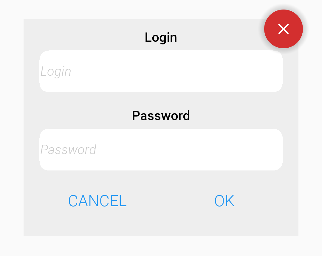
RoundBorder works great for round and pill shapes but the classic square with rounded corners is still only available in the Border class. Normally, this would be enough but there is a lot of nuance we wanted to introduce to that API and a lot that we learned from the RoundBorder. So we created a new class RoundRectBorder which allows you to create a round border that’s more refined. Here I adapted the original RoundBorder sample to work with RoundRect:
Form hi = new Form("RoundRect", new BorderLayout(BorderLayout.CENTER_BEHAVIOR_CENTER));

Button ok = new Button("OK");
Button cancel = new Button("Cancel");

Label loginLabel = new Label("Login", "Container");
loginLabel.getAllStyles().setAlignment(Component.CENTER);

Label passwordLabel = new Label("Password", "Container");
passwordLabel.getAllStyles().setAlignment(Component.CENTER);

TextField login = new TextField("", "Login", 20, TextArea.ANY);
TextField password = new TextField("", "Password", 20, TextArea.PASSWORD);
Style loginStyle = login.getAllStyles();
Stroke borderStroke = new Stroke(2, Stroke.CAP_SQUARE, Stroke.JOIN_MITER, 1);
loginStyle.setBorder(RoundRectBorder.create().
        strokeColor(0).
        strokeOpacity(120).
        stroke(borderStroke));
loginStyle.setBgColor(0xffffff);
loginStyle.setBgTransparency(255);
loginStyle.setMarginUnit(Style.UNIT_TYPE_DIPS);
loginStyle.setMargin(Component.BOTTOM, 3);
Style passwordStyle = password.getAllStyles();
passwordStyle.setBorder(RoundRectBorder.create().
        strokeColor(0).
        strokeOpacity(120).
        stroke(borderStroke));
passwordStyle.setBgColor(0xffffff);
passwordStyle.setBgTransparency(255);


Container box = BoxLayout.encloseY(
        loginLabel,
        login,
        passwordLabel,
        password,
            GridLayout.encloseIn(2, cancel, ok));

Button closeButton = new Button();
Style closeStyle = closeButton.getAllStyles();
closeStyle.setFgColor(0xffffff);
closeStyle.setBgTransparency(0);
closeStyle.setPaddingUnit(Style.UNIT_TYPE_DIPS);
closeStyle.setPadding(3, 3, 3, 3);
closeStyle.setBorder(RoundBorder.create().shadowOpacity(100));
FontImage.setMaterialIcon(closeButton, FontImage.MATERIAL_CLOSE);

Container layers = LayeredLayout.encloseIn(box, FlowLayout.encloseRight(closeButton));
Style boxStyle = box.getUnselectedStyle();
boxStyle.setBgTransparency(255);
boxStyle.setBgColor(0xeeeeee);
boxStyle.setMarginUnit(Style.UNIT_TYPE_DIPS);
boxStyle.setPaddingUnit(Style.UNIT_TYPE_DIPS);
boxStyle.setMargin(4, 3, 3, 3);
boxStyle.setPadding(2, 2, 2, 2);

hi.add(BorderLayout.CENTER, layers);

hi.show();
There are several things we learned from doing the RoundBorder that we applied and did differently in RoundRectBorder:
-
We use the UIID for the background color that just makes sense. We didn’t do the same for the stroke color/foreground color though. The background should now behave nicely including gradients and images!
-
We use millimeters where it makes sense, so a stroke can be in pixels since a 1 or 2 pixel stoke is something you might need but corner radius is always in millimeters as pixels just don’t fit here
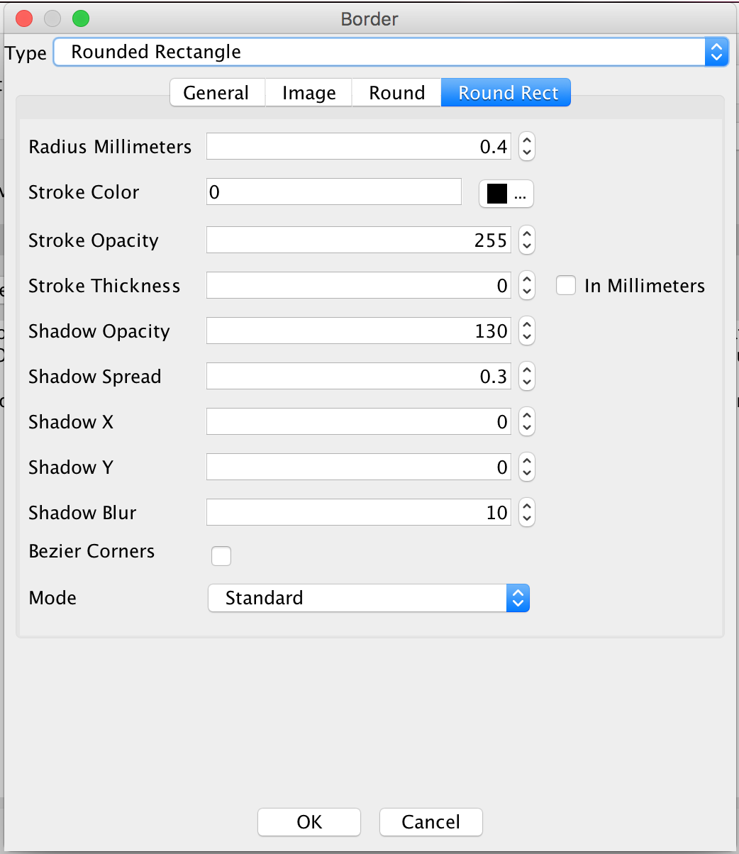
This can also be customized via the designer tool which is another reason we had to change the resource file format:

Ripple Effect
The ripple effect is an Android effect that occurs when you press and hold a button. It ripples slightly.
It’s actually pretty nice and assuring that your touch was intercepted. This effect is implemented in the component level but at the moment it was only turned on for Button. Moving forward this will probably be enabled for MultiButton, SpanButton and other component types.
Every component has a ripple effect flag now that you can check and toggle via isRippleEffect() and setRippleEffect(boolean). In buttons that flag is set from the default state which you can tune via the theme constant buttonRippleBool or via the Button.setButtonRippleEffectDefault(boolean) method.
When a component is pressed and it has the ripple effect we keep painting it until it’s released. During that time we draw a translucent black color on top as a growing circle until it fills up the available space. You can customize the behavior of this painting by overriding paintRippleOverlay(Graphics g, int x, int y, int position). I wouldn’t recommend doing that unless you are going for a completely unique application look.
Button Caps
One of the more controversial changes we made was to upcase all the button text by default for Android. You can disable that behavior by using the theme constant capsButtonTextBool and set it to false or invoking Button.setCapsTextDefault(false).
Android buttons should be upper case but iOS should have correct casing. This is very obvious when looking at iOS/Android UI’s critically. If you want to leave the global behavior but have case correctness for one individual button you can do this by invoking Button.setCapsText(boolean).
In order to reduce the impact of this behavior we didn’t apply it to every Button in existence even when it’s turned on. This only applies to Dialog buttons and buttons with the UIID’s Button or RaisedButton. That means that if you have a custom button UIID you will need to explicitly call setCapsText(Button.isCapsTextDefault()) to force this feature on for that Button.


12 Comments
Great update, it is a joy to see such leaps and bounds in functionality, congrats. Keep up the good work guys!..
I like the ripple effect but it seems like its in slow motion compared to the material design ripple effect, how is the speed controlled?
Right now it’s hardcoded. I looked at several implementations and each one looked very different so I eyeballed it. I’ll try to think of the right way to customize this, can you file an RFE?
Button caps is a bit messy. If you use the GUI Builder it sets the text before setting the UIID so you get caps regardless of UIID (because its ‘Button’ when the text is set) so you can’t use a custom UIID to manage this if you wanted smaller buttons in a lowercase style or whatever. If you did want them caps but then set the text later with setText() it’ll be whatever case you set it as and the UIID has been set by then.
Also if you do use a custom UIID on a lot of buttons and want them in caps you need to call setCapsText(Button.isCapsTextDefault()) on each instance as its not an option you can toggle on all buttons at once or at a UIID level. So it requires additional code throughout simply to achieve what this is setting out to do (Caps on one platform and not on others).
I’m not sure why this system is needed at all really, its not hard to implement if you do need it, not hard to turn off if you don’t want it, but if you do want caps on buttons on Android this system produces inconsistent behaviour.
This is a change that has an effect on the UI of apps currently in development – changing the style between builds, with the default set to be the new behaviour. I don’t think that should be the way that updates like this are rolled out.
Thanks for the feedback. I agree we need a better way to indicate supported/unsupported UIID’s. Any suggestions?
I chose the default to work with specific UIID’s since button is so widespread that doing it for everything might have been even more disruptive.
The goal is to have a default “native” behavior that’s “seamless”. Android does the same thing by styling buttons as all caps by default so this seems like the right thing to do.
In that sense a better place to put this would have been the style text effects property, I chose not to do that for performance reasons but I’m not sure if that was the right call.
I agree that launching something and flipping a default is problematic but leaving something that’s wrong is problematic too. I asked in the original post for suggestions on how we can move things forward without disruption and got crickets…
It’s pretty easy to say “don’t release it like this” without suggesting a better way. We asked this multiple times and suggestions effectively amounted to don’t change the product. Those conflict with the notion of moving it forward:
– Leave it off by default – that’s a bad suggestion. It’s off then no one uses it and it might as well not exist
– Release in a specific time or with huge/many announcements – We did an announcement and included a big “compatibility warning”. Distributed as much as we reasonably can… In the past we did bigger/longer term announcements for similar changes (gradle migration, xcode migration etc). People don’t read these. It’s just a waste of time that delays forward progress
– Add ability to disable this easily – we have that
– Add ability not to be affected – we did this right after the 3.7 release so a versioned build would be relevant and allow you not to feel such issues
We have many changes like this coming so if you have a suggestion I’m listening…
I think it should apply to buttons regardless of style – obviously still with the options to turn it off. Using UIID to signal if it applies or not is a good idea, but only if it was part of the style definition which no doubt adds a whole lot more complexity.
I didn’t think it was too important one way or the other if button labels were in caps on Android – most of my apps aren’t really trying to look native but rather mostly similar but familiar on each platform – but once I suddenly had an Android build that had some buttons in caps and some not it was a mess that needed to be resolved. As the GUI Builder puts them all in caps regardless of UIID but calls to setText may not it took some tidying to put right. In this case I DID go for having all buttons in uppercase on Android mainly because your post highlighted that it was more correct but due to the implementation it was more work than just setting the theme constant and putting it back to proper case.
Obviously changes and progress of your product can’t be a democratic progress where everyone’s view is counted and people are happy all the time, but forced changes especially ones that alter the look and feel of the app are not certainly not desirable. I’d suggest new features or performance enhancements get rolled out straight away as you currently do. But changes to default behaviour do need to be signaled a bit better and they need to be solid when they are made the default.
I check the blog every day, to the point I was worried about you when you went on vacation :). I’ve used the options for the newVM and gradle builds when they were rolled out. It was great to be able to build projects consistently with the old settings while these changes were coming in and also use the new settings for new projects.
So my preference is that any changes to default have some period where the original behaviour is default. I understand why you don’t like this as it makes the roll out more difficult with less initial adoption but its a balancing act between letting developers complete their projects, updating and providing new functionality to your core, and using your developers as guinea pigs on new functionality and disrupting their own progress.
I’m not sure how difficult it is to manage changes with the build process at your end – big red warnings in the console output or something. I’m thinking of the way methods are deprecated before being removed from APIs allows progress and updates while making developers be aware of the upcoming changes and giving them the opportunity to adapt on their schedules.
The GUI builder uppercasing is indeed something we need to fix. You are referring to the new GUI builder right?
I’ve committed a fix for this and will push it into today’s update.
If we were building a new product from scratch I would uppercase all buttons or put this into the style both of which I agree are better choices. The problem is that both would disrupt too many production apps in unpredictable ways. I’d also want this to apply correctly for multibuttons, span buttons etc. as we move forward and none of them are buttons. So the “right thing” here is a bit “off”.
I’m actually all for a democracy here, even in a democracy there is a PM or President who navigates but can’t do stuff congress disagrees with. Unfortunately I made a post about this which got literally zero comments. Maybe it’s the writing that’s too verbose but I’m guessing it’s just hard for people to understand until they see something that impacts their app.
In the past we did a lot of staged rollouts like the ones you describe and the results were the exact same thing. Everyone ignored the rollout until we flipped the default. That made releasing harder as we already moved forward on several fronts and it was harder to revert.
Other tools take the opposite approach to us where developers work on the feature release e.g. 3.7.0 (like our versioned builds) and get an update once every few months that’s really disruptive. Some developers stay on older versions which makes their support process much harder. I don’t think that’s better. Every developer works on a different version and we don’t get immediate feedback for features/bugs so by the time something reaches you guys we forgot why we did something or what we did. Smaller features vanish with big releases like that and it’s harder on everyone.
Using some notification on changes in the build server makes sense for changes like the 64 bit migration (we did that and people still ignore it) but for something like this it doesn’t really make sense. It might seem like a huge disruptive change to you but the fact is that except for a few people who had a problem with it, this went mostly unnoticed by the community at large. That’s a good thing, changes like this should be mostly seamless.
Notice that when Google or Apple update their OS’s a native app that’s already on the device will break and/or change its look. With Codename One updates you will only see it for your builds not for production apps so we are better off than standard native apps in that sense.
I love the fractional padding and margin values. Will this be available in code too?
Like having:
cmp.getAllStyles().setPaddingTop(2.6);
Right now we have only the setPadding(top, bottom, left, right) that accepts float values (not double like your code does). We don’t have the floating point equivalents for setPaddingTop/Bottom/Left/Right. Mostly due to laziness. Notice that if you want to submit a PR you will need to add new methods and can’t change the existing method signature from int to float as that will break binary compatibility.
I’ve added the methods.
Is there a way to use rounded borders from the new GUI builder? In the old builder there was a border wizard that allowed to create custom borders by generating a 9 components image but I could not find it in the new GUI builder and the RoundRectBorder type is not offered as an option (only the “round” border type, that seems to map to RoundBorder exists in the border editor of the new GUI builder)
When you edit a style in the GUI builder it’s meant more as a small override over the default theming. 9-piece borders are a bit more complex as they require image generation and this can get tricky if you have multiple variants.
RoundRectBorder is relatively new and came to be in parallel to this feature. Can you please file an issue on that? It should go into the style UI too.