Codename One ships an iOS Modern (liquid-glass) theme and an Android
Material 3 theme that you can opt your app into with a single build
hint. Both are fully overridable - their color palettes, type
ramps, and state-specific styles are all reachable from your own
theme.css and from runtime API.
The legacy iOS 7 (iOS) and Holo Light (Android) themes remain the default so existing apps see no behavior change.
Inheriting OS colors and fonts
Modern native themes can optionally follow the user’s operating-system settings. Colors and fonts are independent opt-ins; both are off by default. Enable them in an application theme that includes the native theme:
#Constants {
    includeNativeBool: true;
    useNativeColorsBool: true;
    useNativeFontsBool: true;
    useLargerTextScaleBool: true;
}
Alternatively, configure the UIManager before loading the application theme:
UIManager ui = UIManager.getInstance();
ui.setUseNativeColors(true);
ui.setUseNativeFonts(true);
ui.setUseLargerTextScale(true);
An explicit theme constant takes precedence over its Java setter when the theme
is built. After changing a setter on an already loaded theme, call
UIManager.refreshTheme() and refresh/revalidate the visible form. A theme
constant set to false must also be changed or removed before a setter can enable
that option.
Color inheritance feeds the theme’s semantic palette bindings. Font inheritance uses the normal OS UI font family and size while retaining the native theme’s relative heading sizes and styles. Explicit application style properties and palette constants override these inherited defaults. Bundled application fonts and icon fonts aren’t replaced. Legacy hand-authored native themes don’t carry the inheritance metadata and retain their existing appearance.
The existing larger-text accessibility option remains independent. It scales eligible fonts after OS font inheritance, so enabling both doesn’t apply the OS text-size multiplier twice. Existing dark-mode selection remains independent too.
Settings changes and application activation trigger a coalesced theme refresh. The framework preserves application overrides, refreshes visible styles and layout, and restores bundled defaults when settings become unavailable or an inheritance option is disabled. Unsupported settings fall back individually.
| Port | Settings source |
|---|---|
Windows native | Windows UISettings accent/selection palette, high-contrast system colors, and the nonclient message font. Normal Fluent surfaces retain their bundled colors where no corresponding OS value is exposed. |
macOS native | AppKit semantic colors and normal system UI typography. |
Linux native | The active GTK palette and GTK font setting. Only available named colors are inherited; the opposite appearance retains its bundled palette. |
Android | Platform normal text appearance and, on Android 12 or newer, public dynamic-color resources. Older versions retain the bundled palette. |
iOS | UIKit semantic colors on iOS 13 or newer and normal system UI typography. |
JavaSE | Available AWT desktop properties; the simulator uses explicit simulated settings rather than the host’s palette. |
In the simulator, use Simulate > OS Theme Settings to choose an accent and UI
font or reset the simulated settings. These controls exercise the app’s opt-ins;
they don’t enable inheritance for the app. Tests can supply a deterministic
snapshot with JavaSEPort.setSimulatorNativeThemeSettings(…).
Selecting a theme
Three build hints control the platform native theme. None of them are required; with all three unset every app continues to load the legacy theme it always did.
| Hint | Values | Description |
|---|---|---|
|
|
|
|
|
|
|
| Which iOS design generation the modern theme targets. Consulted
only when |
|
| Cross-platform shortcut that sets both |
The legacy and.hololight=true hint still works and maps to
and.themeMode=hololight.
Desktop themes
Windows, macOS and GNOME have their own native themes, selected with
desktop.themeMode on the JavaSE desktop build and with
macos.themeMode on the native macOS port.
| Hint | Values | Description |
|---|---|---|
|
| Unset is |
|
| The native macOS port. When neither this hint nor the shared |
The three desktop themes are generated from native-themes/windows-fluent,
native-themes/macos-aqua and native-themes/gnome-adwaita. They’re
separate files rather than one file with per-platform blocks, and they’re
held to the same surface by DesktopNativeThemeParityTest: the same UIIDs,
the same #Constants, and a $Dark counterpart for everything that paints
a color. That matters to you and not only to the themes — an application
retunes a parent theme by redeclaring #Constants, so one vocabulary means
the same CSS retunes all three platforms rather than only the one it was
written against.
One application on all three
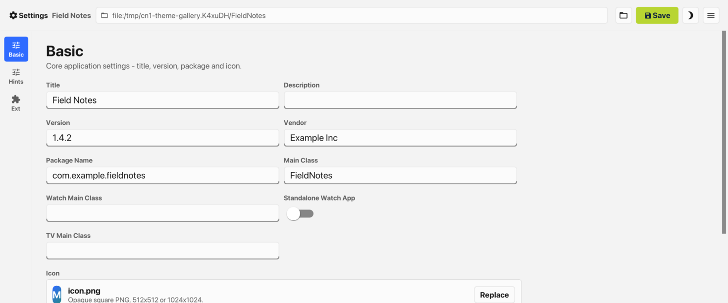
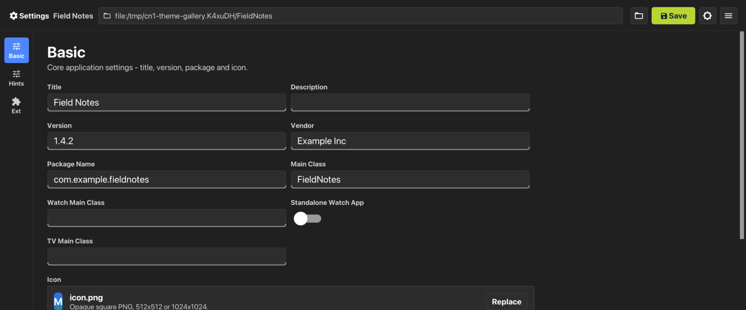
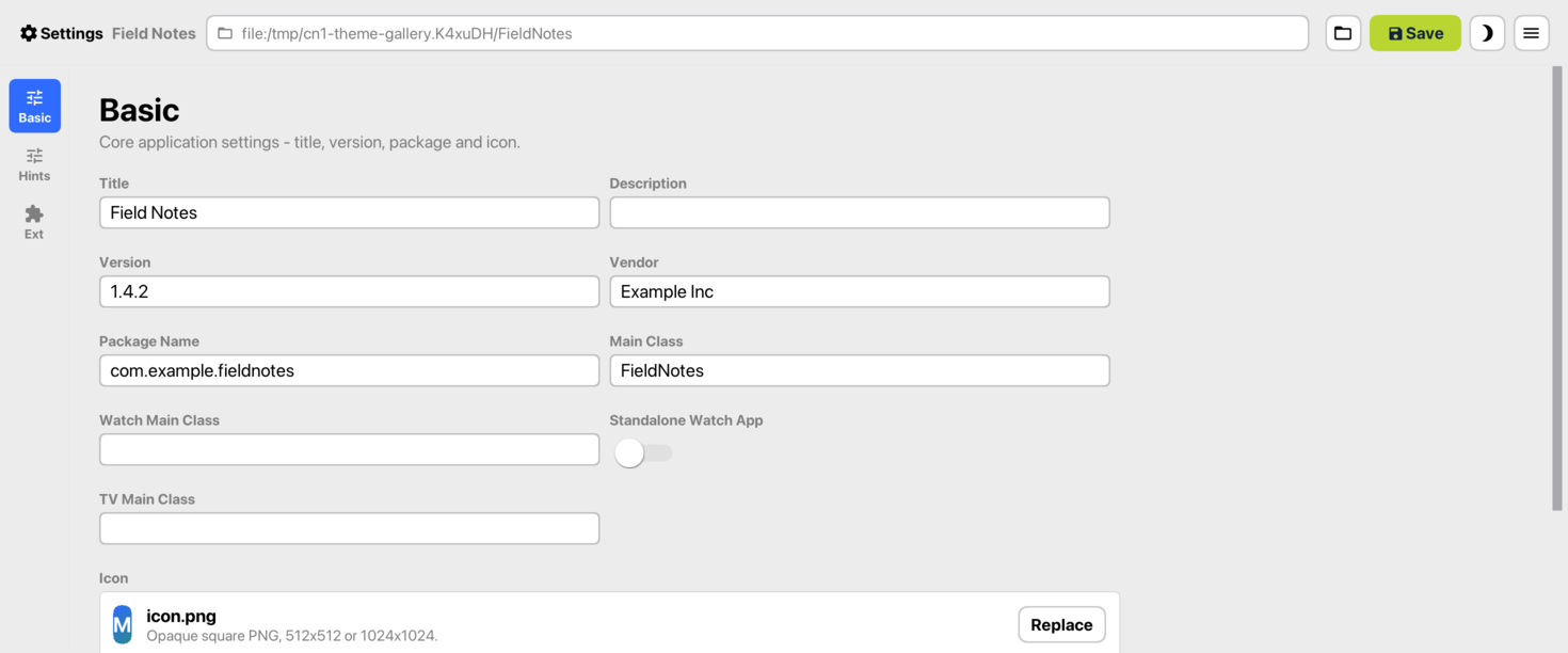
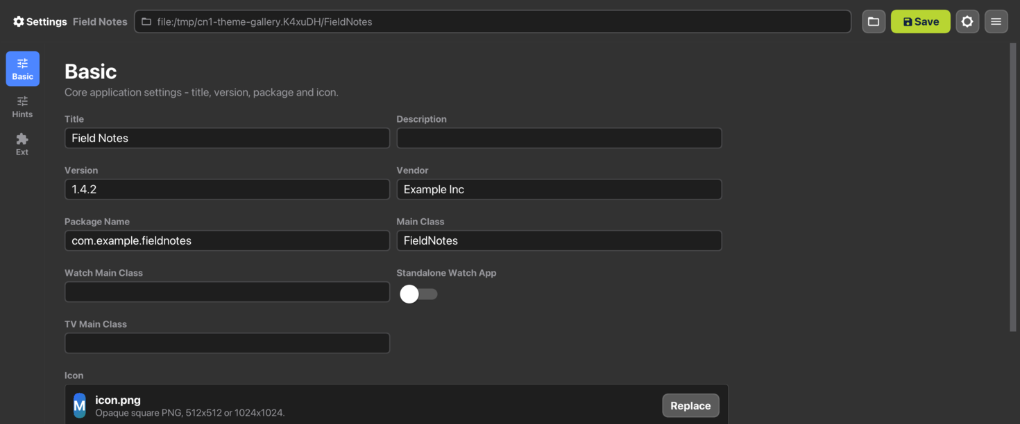
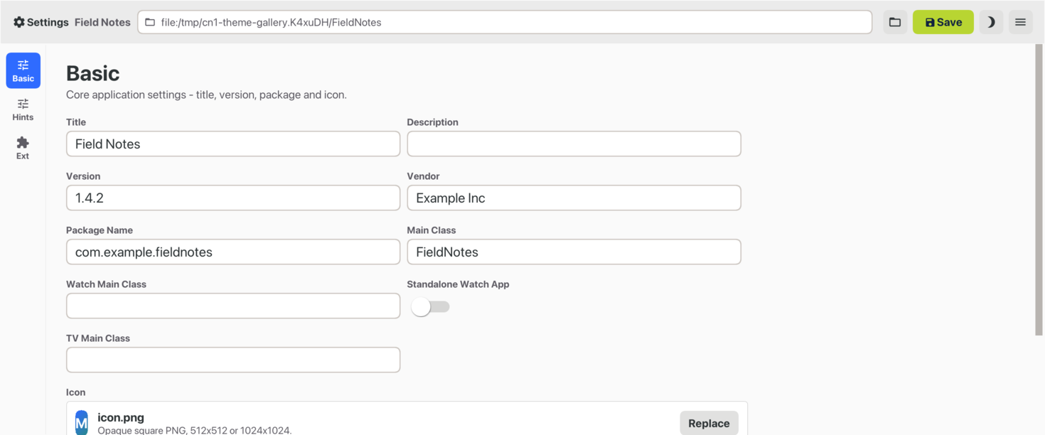
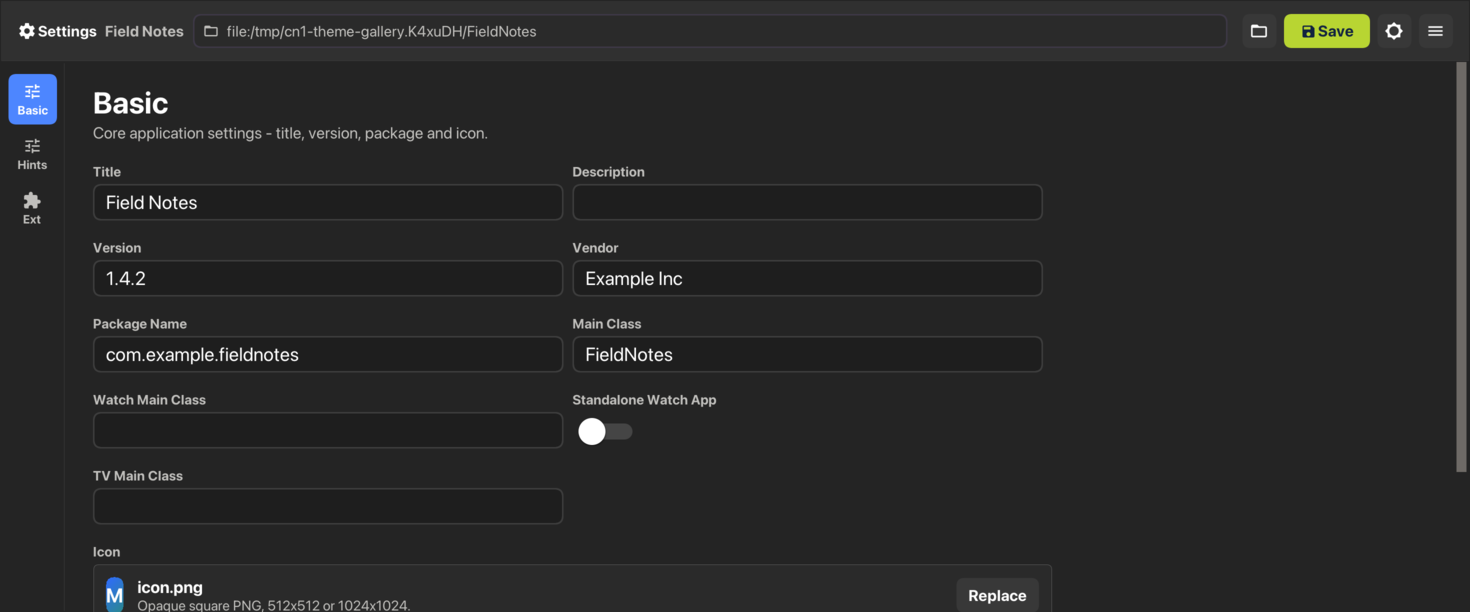
The Codename One Settings tool is built this way. Its main class declares
@DesktopBuild(themeMode = "native"), so it opens in Fluent on Windows,
Aqua on macOS and Adwaita on Linux, and its own theme.css never names a
color the platform owns:
Each control derives from the native UIID it’s a variant of —
cn1-derive: TextFieldfor a field,RaisedButtonfor the primary action,GroupBoxfor a card — so borders, fills and focus rings are the platform’s.Surfaces and text use the palette variables every desktop theme declares, such as
var(--window-bg-color)andvar(--text-secondary-color). At runtime the installed theme’s values replace the ones the compiler baked in.Only the brand is fixed: the tool redeclares
--accent-colorin its#Constants, and the Save button keeps its own green.
In a web browser, nativeTheme=native selects the desktop theme of the
browser’s operating system, and the javascript.titleBar build hint decides
whether the title and the commands stay in the Toolbar or move to an HTML title
bar and menu bar. See Changing the Native Theme.
To preview a desktop theme in the simulator, pick the Desktop skin and
choose the theme from the Native Theme menu. With Auto selected the
Desktop skin follows desktop.themeMode, which is what the packaged
application does.
Hover
Desktop themes carry a state mobile ones have no use for. A .hover rule
styles a component while the pointer is over it:
Button.hover {
    background-color: #f6f6f6;
}
It compiles to hover# entries the same way .pressed compiles to
press#, and Component.getHoverStyle() returns null when the theme
declares none — so a component with no hover rule keeps its normal style
rather than falling back to a blank one.
Hover has no meaning on a touch device and isn’t delivered there. On
desktop it’s driven by real pointer motion: the JavaSE, Windows and Linux
ports all report motion with no button held, which is what
Form.pointerHover resolves against.
Light and dark mode
Both modern themes ship a dark variant via a
@media (prefers-color-scheme: dark) block in their CSS. The CSS
compiler rewrites each rule inside that block into a $Dark<UIID>
style entry; UIManager picks them up whenever
CN.isDarkMode() == true.
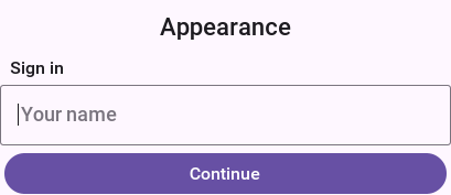
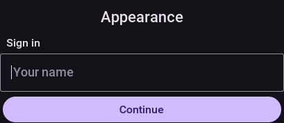
Nothing in that form is styled by hand, so the difference between the two pictures is entirely what the theme’s dark entries supply.
Display.getInstance().setDarkMode(Boolean) controls the active
appearance:
null(the default) - follow the device. iOS readsUITraitCollection, Android readsConfiguration.uiMode. When the user toggles light / dark in system settings the app reflects the change. A JavaSE desktop application reads the system appearance once, at launch:AppsUseLightThemeon Windows,AppleInterfaceStyleon macOS and the GNOMEcolor-schemesetting on Linux. In the simulator the Dark/Light Mode menu decides instead.true/false- force the app into one mode regardless of system setting (useful for theme-preview screens or accessibility toggles).
Material 3 color palette (Android)
The Android Material 3 theme is built around the Material Design 3 "baseline" palette. Each color is referenced from one or more UIIDs; if you change a color the change ripples to every UIID that inherits from it.
| Role | Light | Dark | Used by |
|---|---|---|---|
primary |
|
| Default |
on-primary |
|
| Text printed on top of the primary fill. |
primary-container |
|
|
|
surface |
|
|
|
on-surface |
|
| Body text on surfaces ( |
surface-variant |
|
| Track of the off-state |
on-surface-variant |
|
| Secondary text ( |
surface-container |
|
|
|
surface-container-highest |
|
|
|
outline / outline-variant |
|
|
|
state-pressed |
|
| All |
state-disabled / on-disabled |
|
| All |
To rebrand the app, override the color at the role level rather
than touching every UIID. The example below layers a teal palette
on top from your app’s own theme.css; if you want the same
rebrand to apply at runtime (for in-app accent toggles, branded
flavours, A/B tests) without recompiling the theme, see
Runtime accent palette override further down - a single
addThemeProps({"@accent-color": …}) call retunes every
accent-bearing UIID at once:
#Constants {
    includeNativeBool: true;
    darkModeBool: true;
}

/* Touch the four UIIDs that paint with primary / primary-container.
   The role-as-rule pattern keeps brand changes localised. */
Button { background-color: #00796b; }
Button.pressed { background-color: #4db6ac; color: #00251a; }
RaisedButton { background-color: #b2dfdb; color: #00251a; }
RaisedButton.pressed { background-color: #80cbc4; }
SelectedTab { color: #00796b; }
BackCommand { color: #00796b; }
TitleCommand { color: #00796b; }
iOS modern color palette
The iOS modern theme follows Apple’s system palette.
| Role | Light | Dark | Used by |
|---|---|---|---|
accent |
|
|
|
accent-pressed |
|
| All |
accent-disabled |
|
| All |
surface |
|
| Pure surface used by |
surface-grouped |
|
| Form / ContentPane (the iOS "grouped" form bg). |
surface-tertiary |
|
|
|
text-primary |
|
|
|
text-secondary |
|
|
|
text-tertiary / text-disabled |
|
|
|
separator |
|
|
|
success |
|
|
|
To layer a brand color on top, override RaisedButton and
accent-driven UIIDs the same way as Android above. The color names
match Apple’s UIColor.systemBlue etc. So you can mirror the SF
Symbols semantics if you want.
Accent palette override
Both shipped native themes expose their accent palette as named
constants you can retune from your app’s own theme.css (or, for
dynamic theming, at runtime). The CSS source uses
var(--accent-color, fallback) references so the fallback ships as
the baked-in default (the .res file loads fine with no override)
and the compiler additionally emits a
@cn1-bind:<UIID>.<key>=accent-color constant alongside each
affected style key. When the resolved theme constants pick up a new
@accent-color value (whether from your CSS or via runtime
UIManager.addThemeProps), the framework fans the override out to
every bound UIID at once - no per-UIID rule duplication, no theme
recompile.
| Constant | Light default | Dark default | Drives |
|---|---|---|---|
|
| (see |
|
| n/a |
|
|
|
|
| All |
|
|
| All |
|
| (same) | Text color painted on top of the accent fill. |
| Constant | Light default | Dark default | Material 3 token |
|---|---|---|---|
|
|
|
|
|
|
|
|
|
|
|
|
|
|
|
|
|
|
|
|
Override from your app’s theme.css (recommended)
Redeclare the accent variable inside the #Constants block of your
app’s theme.css. The framework’s CSS compiler exports any
--name declaration in #Constants as a @name theme constant,
so the value flows through the same binding pass that handles
runtime overrides:
#Constants {
    includeNativeBool: true;
    darkModeBool: true;

    /* Override the native theme's accent palette. The compiler picks
       up these declarations from #Constants and exports them as
       @accent-color / @accent-color-dark theme constants so every
       UIID bound to var(--accent-color) in the parent native theme
       picks them up at app launch - no per-UIID rule edit needed. */
    --accent-color: #ff2d95;
    --accent-color-dark: #ff2d95;
    --accent-pressed-color: #c71a75;
    --accent-pressed-color-dark: #c71a75;
    --accent-on-color: #ffffff;

    /* Material 3 RaisedButton uses a separate "container" tonal
       pair; iOS ignores these (no bindings reference them) so it's
       safe to set them unconditionally. */
    --accent-container-color: #ff2d95;
    --accent-container-color-dark: #ff2d95;
    --accent-on-container-color: #ffffff;
    --accent-on-container-color-dark: #ffffff;
}
Bindings that reference a constant you didn’t override stay at
their baked-in default, so a partial override (for example, just
--accent-color) is fine.
Runtime override
For dynamic theming - in-app accent toggles, branded flavours,
A/B tests - push the same constants through
UIManager.addThemeProps after the theme has been installed:
Hashtable override = new Hashtable();
override.put("@accent-color", "ff2d95");
override.put("@accent-color-dark", "ff2d95");
override.put("@accent-pressed-color", "c71a75");
override.put("@accent-pressed-color-dark", "c71a75");
override.put("@accent-on-color", "ffffff");
// every colour that has a -dark twin needs both, or dark mode keeps the
// theme's original value for the half you left out
override.put("@accent-on-color-dark", "ffffff");
override.put("@accent-disabled-color", "f9a8d0");
override.put("@accent-disabled-color-dark", "7a1547");
override.put("@accent-container-color", "ff2d95");
override.put("@accent-container-color-dark", "ff2d95");
override.put("@accent-on-container-color", "ffffff");
override.put("@accent-on-container-color-dark", "ffffff");
UIManager.getInstance().addThemeProps(override);
// null before the first form is shown, which is exactly when a branded
// flavour applies its overrides; forms built afterwards pick the new
// props up on their own
Form current = CN.getCurrentForm();
if (current != null) {
    current.refreshTheme();
}
Values can be passed with or without the leading # and in any
case; the runtime accepts "ff2d95", "#FF2D95", and the 3-digit
shorthand "#f0a" interchangeably.
PaletteOverrideThemeScreenshotTest in the hellocodenameone test
suite exercises this path against both native themes, light + dark.
When the override path doesn’t apply
The binding mechanism handles every accent UIID the shipped themes
expose. For other widgets - or when you want to override a color
the native CSS hard-codes (for example, the iOS success green on
Switch.selected) - either:
Layer a per-UIID redeclaration in your app’s
theme.css(seeCustomizing in your own themebelow). Right when you want to tweak a UIID the binding vocabulary doesn’t already cover.Or pass the specific UIID/state key directly into
UIManager.addThemeProps(Switch.sel#bgColoretc.). Runtime, bypasses the binding system. Right when you need a one-off color tweak you can’t anchor in CSS.
Platform-specific UIIDs
A handful of UIIDs exist only because one platform draws them differently from the other. They’re still safe to override; you just want to know which platform’s screen the override is going to land on.
iOS-only behavior:
Toolbar,TitleArea,Titlepaint over the status-bar area. iOS reserves room above for the notch / status bar; in your capture this reads as a colored strip at the top of the Form. In production the device fills it with system content (signal, battery, time).MultiButtonis styled as an iOS Settings row (multi-line text ramp + chevron). Compare against Material 3’s denser list-item pattern.
Android-only behavior:
Toolbardoesn’t paint over the system status bar; the native Android status bar handles that.Tabsuse Material 3 top tabs (flat, underline-by-color). iOS modern renders Tabs as a bottom-anchored pill group via thetabPlacementIntconstant - that constant is intentionally only set in the iOS theme so behavior stays consistent on each platform.
Switching CheckBox / RadioButton glyphs
The default check / radio glyphs are Material icons drawn by
DefaultLookAndFeel. The theme can swap them via four optional
constants (Material codepoints):
| Constant | Default | Notes |
|---|---|---|
|
| Override to for example, |
|
| Match the empty version of whatever you chose above. |
|
| Filled circle with dot. |
|
| Empty circle. |
Set these in your #Constants { … } block; the icons rebuild on
the next style refresh.
Component-specific tuning constants
| Constant | Effect |
|---|---|
| Stretches the Switch track. Larger X = longer pill, larger Y = thicker. iOS uses 2.5 / 1.5; Material uses 3.0 / 0.9. |
| Scales the Switch thumb relative to the track. iOS 1.4, Material 1.5. |
| Pixels of breathing room between thumb and track. |
| iOS draws a faint ring around the off-state track; Material does not. |
|
|
| Distribute tabs evenly across the bar. |
|
|
| Duration of the indicator tween in milliseconds (default |
| Indicator underline thickness in millimetres (default |
|
|
| Outer diameter of the modern arc spinner in millimetres (default |
| Stroke thickness of the modern arc spinner in millimetres (default
|
|
|
iOS 26 Liquid Glass tab selection morph
When the iOS modern theme renders Tabs as a bottom bar
(tabPlacementInt: 2) the selected tab is marked by a Liquid Glass
drop — a frosted, magnifying glass capsule painted over the (dark)
icons rather than a flat highlight. On a selection change the drop springs
across to the new tab, elongating while it travels and settling with a
small overshoot. The selected blue is supplied by the drop itself (a
luminance-keyed dark→accent tint of the glyph beneath it), so the color
travels with the drop instead of snapping between tabs.
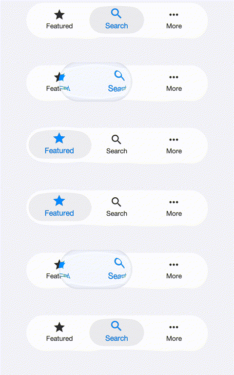
On iOS the drop is rendered live by a Metal fragment shader that samples
the bar beneath it on the GPU, so the morph runs at frame rate with no
screen read-back; other platforms and the simulator use the equivalent CPU
lens. The effect is opt-in: the iOS modern theme sets
tabsSelectionCapsuleBool: true and glassMaterialBool: true. Without the
glass flag the capsule degrades to a plain translucent pill.
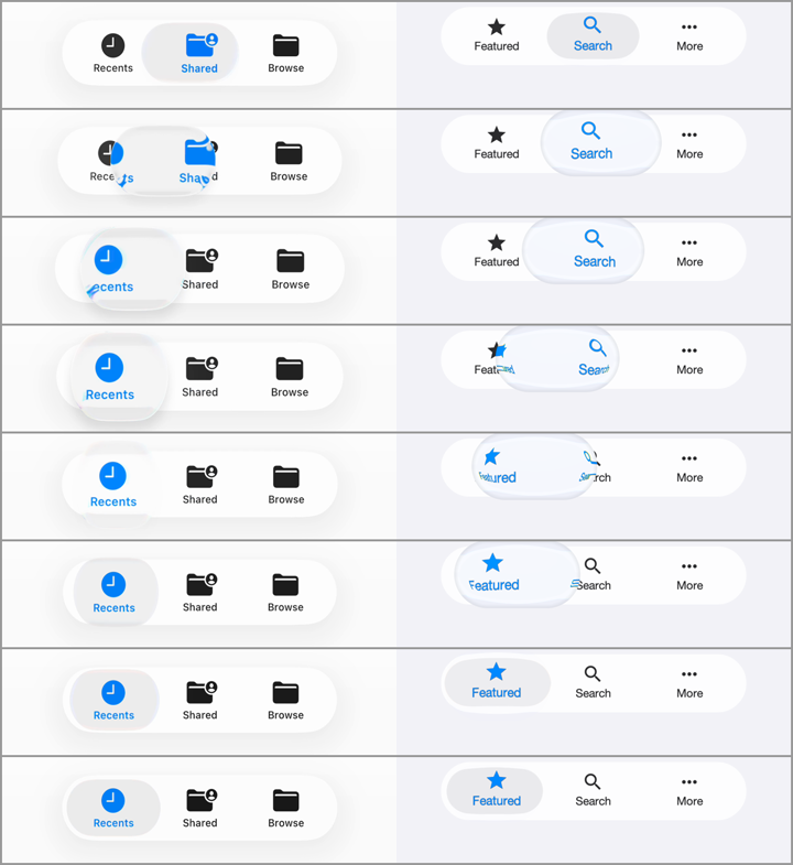
The morph is developed against the real OS control: the frame-by-frame comparison below shows the native iOS 26 tab bar (left) and the Codename One render (right) at matching moments of the selection travel.
The animation is controlled by a named motion preset plus a handful of
high-level knobs. The detailed envelopes (stretch, squash, lift, lens
magnification, aberration, tint timing) live inside the preset in the
motion model (TabSelectionMorph), where they’re pinned by unit test and
validated frame-by-frame by the fidelity suite — a theme picks a preset
and scales it rather than tuning a dozen loose constants:
| Constant | iOS modern | Effect |
|---|---|---|
|
| Master switch for the selection drop. Off falls back to the legacy
colored underline indicator ( |
|
| The named motion preset: |
|
| Morph duration in milliseconds. Lower is snappier. |
|
| Scales the drop’s optics (magnification, chromatic aberration, accent
tint) around the preset: |
|
| Scales the settle overshoot: |
|
| The accent the dark glyph is tinted to inside the drop. |
The iOS 27 theme uses a third preset, ios27, which is time based rather
than a fixed-duration morph. Its curves are measured from a real
UITabBarController on the iOS 27 simulator, frame by frame, and played back
by TabGlassMotion:
on a tap the selection lens lifts: it grows, its platter fades so it becomes clear glass, and the tab content seen through it magnifies;
it travels on a spring, stretching while it accelerates and squashing on arrival in proportion to the distance, then settles with a second, smaller wobble;
the whole bar — glass, content and lens — pulses in scale, and a soft glow spreads from where the finger touched.
The motion follows the gesture, not just the tap, the way UIKit’s does:
holding a press keeps the lens lifted and the bar grown until the finger lifts;
pressing the selected tab lifts and pulses the lens in place;
dragging along the bar pulls the lens with the finger (a scrub), and letting go selects the tab under the finger, with the lens settling there;
every release ends in a small wobble about a second after the finger lifts.
The accent color lives in a second copy of the tab content, visible only
through the lens, so the color travels with the glass. Where the port
supports Graphics.colorMatrixRegion (iOS, macOS, the JavaScript port and the
simulator), the tab content is vibrant like UIKit’s: each glyph pixel is a
color matrix of the glass behind it rather than flat paint, so labels and the
accent pick up the colors under the bar. The selection platter is likewise the
bar’s own glass seen through a color matrix, not a translucent fill. With this
preset the tabs are painted with their normal style outside the lens and with
their pressed style inside it: the theme’s Tab/TabIcon colors are the
unselected ones and Tab.pressed/TabIcon.pressed the selected ones. Tab
backgrounds should stay transparent.
The motion reaches past the bar’s visible pill, so the bar reserves room for
it inside its own bounds: the theme widens the TabsContainer padding by the
slack, narrows its margin by the same amount so the pill stays where it was,
and names the slack in constants. Everything the motion paints then stays
inside the bar’s own bounds and repaint region.
| Constant | iOS 27 | Effect |
|---|---|---|
|
| Selects the measured time-based motion described above. |
|
| How much of the |
|
| Inset of the resting lens inside the pill. |
|
| Color and alpha of the resting selection platter on ports without
|
|
| The same platter in the dark appearance; defaults to the light values. |
|
| White wash of the lifted lens, which reads brighter than the bar. |
|
| Alpha of the lifted lens’s bright inner rim and dark edge ring, scaled by the lift. |
|
| Strength of the touch glow; |
|
| Peak alpha of the bright rim along the bar’s top and bottom edges; |
Similarly, the Liquid Glass backdrop materials themselves are typed,
named recipes (GlassRecipe): a theme assigns chrome (edge-anchored
bars), pill (the floating tab bar) or panel (buttons, dialogs, panels — the default) per UIID with <UIID>GlassRecipe constants, e.g.
ToolbarGlassRecipe: "chrome". Each recipe bundles the measured
saturation/scale/offset color transform and edge optics of one native
material, so similar glass surfaces can’t drift apart one constant at a
time.
Switch thumb uses the same discipline for its liquid
droplet morph (switchLiquidGlassBool, stretch/squash while sliding,
frame-validated):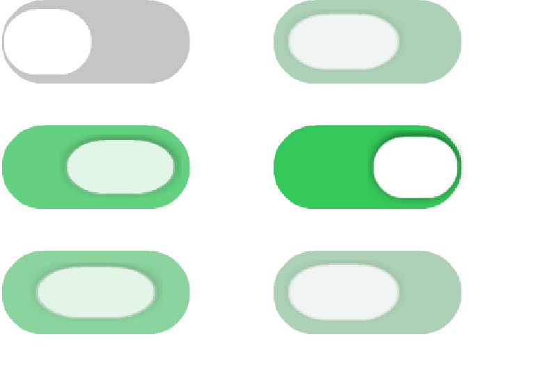
Customizing in your own theme
Your app’s theme.css inherits from the installed native theme:
#Constants {
    includeNativeBool: true;
    darkModeBool: true;
}

/* Tweak only what's different. Everything you do not redeclare
   keeps coming from the native theme. */
RaisedButton { background-color: #d81b60; }
RaisedButton.pressed { background-color: #b71c5c; }
RaisedButton.disabled { background-color: #ffd6e2; color: #ffffff; }

@media (prefers-color-scheme: dark) {
    RaisedButton { background-color: #ff80ab; color: #4a0026; }
    RaisedButton.pressed { background-color: #f06292; }
}
The user’s CSS is layered on top of the native theme at app launch, so refresh / restart picks the override up.
For a wholesale accent rebrand prefer redeclaring the
--accent-color (etc.) variables in your #Constants block - see
Override from your app’s theme.css above. That single declaration
fans out through every UIID bound to the variable in the native
theme, no per-UIID rules required. Per-UIID redeclaration here
remains the right choice for tweaking non-accent properties
(typography, spacing, surface fills) the binding vocabulary doesn’t
cover.
Inheriting from a native UIID
cn1-derive lets a custom UIID start from one of the native
theme’s UIIDs and refine it:
DangerButton {
    cn1-derive: RaisedButton;
    background-color: #d32f2f;
}
DangerButton.pressed {
    cn1-derive: RaisedButton;
    background-color: #b71c1c;
}
cn1-derive works best when the relationship is child refines
parent. Avoid deriving across unrelated UIIDs (for example, a TitleArea
that derives from Toolbar) - inline the properties instead.
Translucency, glass effects, and the test harness
The iOS modern Dialog and Tabs use translucent surfaces (rgba with
alpha < 1) so any backdrop reads through the widget. To exercise
this in screenshot tests, the hellocodenameone fidelity tests
opt-in to a diagonal-stripe textured backdrop on the form
(useTexturedBackdrop() in DualAppearanceBaseTest). Translucent
widgets show their see-through tint against the stripes; opaque
widgets cover the stripes entirely.
CSS backdrop-filter: blur(<length>) and filter: blur(<length>) are
now recognized by the compiler and persisted in the theme as the
backdropFilterBlur and filterBlur Style properties (also reachable
programmatically via Style#getBackdropFilterBlurRadius() /
Style#getFilterBlurRadius()). Image-level blur is hardware-accelerated
(CIGaussianBlur on iOS, RenderScript / RenderEffect on Android,
JHLabs GaussianFilter in the simulator). Painting the blur into the
component framebuffer is still being wired up; until that lands, the
rgba approximation above remains useful for translucent surfaces.