A Kanban board shows work as cards in columns, one column for each stage the
work passes through. Moving a card to the next column is how its state
changes. KanbanBoard is that board: the user drags cards within a column and
between columns, reorders and folds the columns, and adds and renames cards in
place.
The component is in com.codename1.ui.kanban. It draws from a model in
com.codename1.kanban that has no user interface in it, so a board can be
built, tested and stored without a form on the screen.
Like NodeGraph, the board paints its cards instead of building a component
for each one, and the whole board scrolls as one surface under column titles
that stay in view.
A first board
A KanbanColumn has an id and a title. A KanbanCard has an id and a title
too, and may carry a description, tags and a short badge such as a due date
or an estimate.
DefaultKanbanModel model = new DefaultKanbanModel();
model.addColumn(new KanbanColumn("todo", "To do"));
model.addColumn(new KanbanColumn("doing", "Doing"));
model.addColumn(new KanbanColumn("done", "Done"));

model.addCard("todo", new KanbanCard("c1", "Dark mode for the settings screen")
        .addTag("ui").setBadge("3d"));
model.addCard("todo", new KanbanCard("c2", "Crash on rotate")
        .setDescription("Only on tablets, only in the gallery").addTag("bug"));
model.addCard("doing", new KanbanCard("c3", "Offline drafts").addTag("sync"));
model.addCard("done", new KanbanCard("c4", "Upgrade the database"));

KanbanBoard board = new KanbanBoard(model);

Form form = new Form("Sprint", new BorderLayout());
form.add(BorderLayout.CENTER, board);
form.show();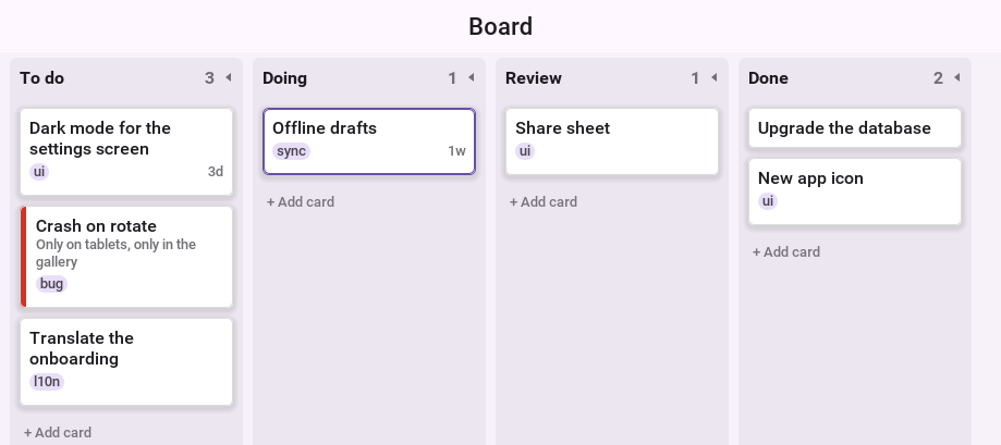
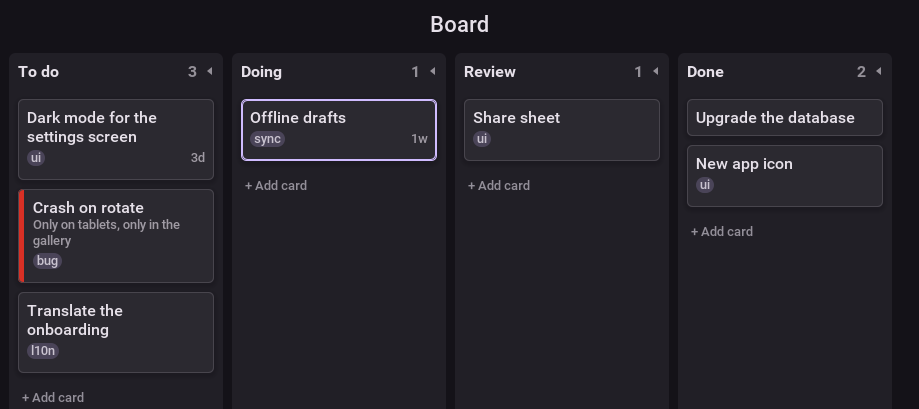
With a mouse, a card is dragged directly. With a finger, a drag scrolls the
board and a long press picks the card up, so the two gestures don’t compete.
setDragEdits chooses one behavior for both. While a card is held, the other
cards of the column under it make room where it would land.
On a phone, where one column fills most of the screen, setColumnSnap(true)
brings scrolling to rest with a column at the leading edge.
A column title is dragged the same way to move the column. The mark at the end of a title folds the column to a strip that shows only its count, and a tap on the strip opens it again.
Limits and swim lanes
A column with setWipLimit shows its count against the limit, and is marked
when it holds more. By default that’s only a warning. A model with
setEnforceWipLimits(true) refuses the card that would go past the limit, and
the board shows the refusal while the card is still held over the column.
Adding KanbanLane objects to the model splits the board into swim lanes,
one row of cells for each. A lane has a title bar across the board, and a tap
on it folds the lane. A card belongs to a lane through setLaneId, and
dragging it into another lane changes that.
DefaultKanbanModel model = new DefaultKanbanModel();
model.addColumn(new KanbanColumn("todo", "To do"));
model.addColumn(new KanbanColumn("doing", "Doing").setWipLimit(2));
model.addColumn(new KanbanColumn("done", "Done").setCollapsed(true));
model.setEnforceWipLimits(true);

model.addLane(new KanbanLane("app", "App"));
model.addLane(new KanbanLane("server", "Server"));

model.addCard("todo", new KanbanCard("c1", "Dark mode").setLaneId("app"));
model.addCard("doing", new KanbanCard("c2", "Offline drafts").setLaneId("app"));
model.addCard("todo", new KanbanCard("c3", "Rate limit the login").setLaneId("server"));
model.addCard("doing", new KanbanCard("c4", "Move reports to a queue").setLaneId("server"));

KanbanBoard board = new KanbanBoard(model);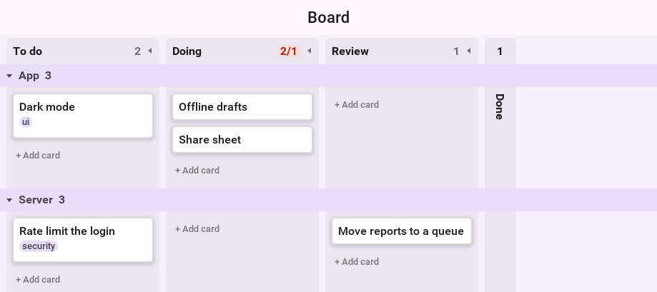
Adding and editing cards
Each column ends in a row that adds a card. A tap on it opens a text field in
place, and the title typed there becomes a new card at the end of the column.
A double tap on a card renames it the same way. setInlineAdd(false) removes
the row. With setInlineEditing(false), a double tap tells the listeners the
card was opened instead, which is where an application shows its own details
form.
With a keyboard, Delete or Backspace removes the selected card, Enter opens
it, and with Control or Command, C, X, V and D copy, cut, paste and duplicate
it, while Z undoes and Shift-Z or Y redoes. A phone
has no such keys, so the same commands are methods of the board, ready for a
menu or a toolbar: copySelection, cutSelection, paste,
duplicateSelection, undo and redo.
setEditingEnabled(false) makes the board read-only, undo and redo included.
Columns and lanes still fold, and a fold made then isn’t a step to undo.
The board takes its colors from the Kanban* UIIDs of the theme, not from
its own style, so restyle it through the theme.
Listening and refusing
Every edit is offered to the board’s listeners before it reaches the model. A
listener that returns false refuses it, and the card goes back to where it
was. Extend KanbanAdapter to implement only what you need.
KanbanBoard board = new KanbanBoard(new DefaultKanbanModel());
board.addKanbanListener(new KanbanAdapter() {
    @Override
    public boolean cardMoving(KanbanBoard b, KanbanCard card, KanbanColumn column,
            KanbanLane lane, int index) {
        // only reviewed work may be finished
        return !"done".equals(column.getId()) || card.getTags().contains("reviewed");
    }

    @Override
    public void cardMoved(KanbanBoard b, KanbanCard card) {
        Log.p(card.getTitle() + " is now in " + card.getColumnId());
    }

    @Override
    public void cardOpened(KanbanBoard b, KanbanCard card) {
        Log.p("Show the details of " + card.getId());
    }
});
The edits the user makes are also methods of the board: moveCard, addCard,
renameCard, removeCard and moveColumn. They go through the listeners
and the undo history the way a gesture does, so a menu or a toolbar button
behaves like the drag it stands for.
A model of your own extends AbstractKanbanModel, which keeps the listeners
and refuses every edit, so a model is read-only until it overrides moveCard,
insertCard and the other edit methods. Each returns false to refuse a change. A model backed by a server applies the change and tells the server
there.
Undo and saving
The board records its edits in the application’s history,
UndoHistory.getGlobal(), which NodeGraph and the text editors share, so
one Undo button serves them all. Showing another model with setModel drops
that model’s steps and keeps the rest of the history. KanbanJson writes a model as JSON text
and reads it back.
KanbanBoard board = new KanbanBoard(new DefaultKanbanModel());
// later, from a button or a menu: the last change in the application
UndoHistory.getGlobal().undo();

Preferences.set("board", KanbanJson.toJson(board.getModel()));
String saved = Preferences.get("board", null);
if (saved != null) {
    try {
        board.setModel(KanbanJson.fromJson(saved));
    } catch (IOException notABoard) {
        Log.e(notABoard);
    }
}
The look of a card
DefaultKanbanCardRenderer draws a card’s title, up to two lines of its
description, its tags and its badge. setAccent gives the cards with a style
key a strip of color, and setTagColor gives a tag a color of its own. For a
different card, implement KanbanCardRenderer. It says how tall a card is at a
width and paints it.
A card can carry a real component as well, such as a progress bar or a
button. A KanbanCardFactory is asked for one per card, and the component is
drawn along the bottom of the card. It’s drawn with the card and isn’t added to
the form, so a board of many cards stays cheap. A tap on it reaches it, which
is enough for a button. After changing what it shows, repaint the board.
DefaultKanbanModel model = new DefaultKanbanModel();
model.addColumn(new KanbanColumn("todo", "To do"));
model.addCard("todo", new KanbanCard("c2", "Crash on start"));
KanbanBoard board = new KanbanBoard(model);
DefaultKanbanCardRenderer renderer = new DefaultKanbanCardRenderer();
renderer.setAccent("bug", 0xd93025);
renderer.setTagColor("ui", 0x34a853);
board.setCardRenderer(renderer);
board.getModel().getCard("c2").setStyleKey("bug");

board.setCardFactory(new KanbanCardFactory() {
    @Override
    public Component createComponent(KanbanBoard b, KanbanCard card) {
        if (!(card.getUserData() instanceof Integer)) {
            return null;
        }
        Slider progress = new Slider();
        progress.setProgress(((Integer) card.getUserData()).intValue());
        return progress;
    }
});
The board is styled through these UIIDs, which the native themes define:
| UIID | Used for |
|---|---|
| The background |
| The panel of a column |
| A column’s title and count |
| The count of a column over its limit, and a refused drop |
| A card, its border and its text |
| The outline of the selected card |
| The tags, the badge and the description |
| The title bar of a swim lane |
| The row that adds a card |
| The place a held card would land |