In this chapter this guide covers theming with CSS in Codename One.
Activating CSS
Codename One applications always use the resource file. The CSS support compiles a file in CSS syntax to a Codename One resource file and adds it to the application. In runtime the CSS no longer exists and the file acts like a regular theme file.
New Maven projects enable CSS by default with codename1.cssTheme=true in common/codenameone_settings.properties. Add that property manually if you are migrating an older project where CSS support is disabled.
Once enabled your theme.res file will regenerate from a CSS file that resides under the css directory. Changes you make to the CSS file will instantly update the simulator as you save. But, there are some limits to this live update so sometimes a simulator restart would be necessary.
Layering one theme over another
Compiling CSS in a Maven project rewrites the build’s theme.res in place. The
compiler reads src/main/css, merges in whatever CSS the project’s dependencies
contribute, and writes the result as the theme the app loads. What it doesn’t do
is keep an older Designer resource underneath: there’s no second file and no
overlay involved.
Something does sit beneath the compiled styles, though. The theme.css a new
project starts with sets includeNativeBool: true, and UIManager installs the
platform’s native theme before it applies the compiled one, so a property you
leave out of CSS can still arrive from there.
Layering is a separate mechanism that you ask for explicitly. A theme constant
named OverlayThemes holds a comma-separated list of resource names, each
without the .res extension.
Write that name bare wherever you author it. The Designer’s constant editor and
a CSS #Constants block both add the @ that theme constants are stored with,
exactly as they do for includeNativeBool or commandBehavior, so typing
@OverlayThemes in either place produces @@OverlayThemes and nothing ever
reads it. The stored key is @OverlayThemes, which is what you see in the
resource and what code setting the property directly has to use.
In a CSS #Constants block, quote the value whenever you name more than one
overlay. The compiler keeps only the first value it parses out of the
declaration, so OverlayThemes: base,extra; loses extra without a word while
OverlayThemes: "base,extra"; keeps both.
When UIManager finishes building a theme it reads that constant, opens each
name in turn from the resource root and applies its properties over the ones
already loaded, so a later overlay beats an earlier one and every overlay beats
the theme that named them.
Reach for it when you want to override a theme you don’t own — one shipped inside a cn1lib, for instance — without editing the original. It’s also what the Designer’s CSS installer writes when it adds a stylesheet on top of an existing Designer theme, which is a migration path for older projects rather than the way a CSS project is built today.
Supported CSS selectors
Since Codename One stylesheets are meant to be used with Codename One component hierarchies instead of XML/HTML documents, selectors work a little differently.
All selectors (with some specific exceptions discussed below) are interpreted as UIIDs.
Only 4 predefined CSS classes are supported:
.pressed: Targets the component when in "Pressed" state..selected: Targets the component when in "Selected" state..unselected: Targets the component when in "Unselected" state..disabled: Targets the component when in "Disabled" state.If no class is specified, then the selector targets "all" states of the given component.
The following are a few possible selectors you can include in your stylesheet.
Button: Defines styles for the "Button" UIID.Button.pressed: Defines styles for the "Button" UIID’s "pressed" state.Button, TextField, Form: Defines styles for theButton,TextField, and "Form" UIIDs.
The following example creates a simple button with a border, and text aligned center. By default the button will have a transparent background, but when it’s pressed, it will have a gray background:
Button {
    text-align: center;
    border: 1pt solid gray;
    background-color: transparent;
}

Button.pressed {
    background-color: gray;
}
Inheriting properties using cn1-derive
The following example defines a custom Button style named "MyButton" that inherits all the styles of Button but changes the background color to blue:
MyButton {
   cn1-derive: Button;
   background-color: blue;
}
Special selectors
#device
The #Device selector allows you to define which device resolutions this CSS file should target. Mutli-images generated from this style-sheet will be included variants for device resolutions in the range (min-resolution, max-resolution) as defined in this section. By default all resolutions are generated:
#Device {
    min-resolution: 120dpi;
    max-resolution: 480dpi;
    resolution: 480dpi;
}
#constants
The #Constants selector allows you to specify theme constants.
For example:
#Constants {
    includeNativeBool: true;
    commandBehavior: "Side";
    defaultFontSizeInt: 18;
    defaultDesktopFontSizeInt: 14;
    defaultSourceDPIInt: "0";
    menuImage: "menu.png";
}

MenuIcon {
    background-image: url(images/menu.png);
}
In the above example, the constants referring to an image name as a string requires that the image exists in one of the following locations:
res/<cssfilename>/<imageName>../res/<cssfilename>/<imageName>../../res/<cssfilename>/<imageName>
It must also have been defined as a background image in some selector in this CSS file.
Default
The Default selector is special in that it will set properties on the theme’s "default" element. The default element is a special UIID in Codename One from which all other UIIDs in the same theme are derived. This is a good place to set things like default fonts or background-colors.
Standard CSS properties
padding(and variants)margin(and variants)border(and variants)border-radiusbackground(Usage below)background-colorbackground-repeatbackground-imageborder-imageborder-image-slicefont(Usage is covered in the following font section)font-family(Usage is covered in the following font section)font-style(Usage is covered in the following font section)font-size(Usage is covered in the following font section)@font-face(Usage is covered in the following font section)colortext-aligntext-decoration(Usage below)opacitybox-shadowwidth( used for generating background-images and borders)height( used for generating background-images and borders)
Custom properties
cn1-source-dpiUsed to specify source DPI for multi-image generation of background images. Accepted values:
0(Not multi-image),120(Low res),160(Medium Res),320(Very High Res),480(HD), Higher than480(2HD). If not specified, the default value will be the value of thedefaultSourceDPIInttheme constant, if specified, or480, if not specified.cn1-background-typeUsed to explicitly specify the background-type that should be used for the class.
cn1-9patchUsed to explicitly specify the slices used when generating 9-piece borders. Deprecated - Use
border-imageandborder-image-slicefor 9-piece borders.cn1-deriveUsed to specify that this UIID should derive from an existing UIID.
CSS variables
As of CodenameOne 7.0, you can use variables in your CSS file via the var() CSS function. For example:
#Constants {
    --header-color: blue;
}

Header {
    color: var(--header-color, blue);
}
The var() function can be used inside property values. That is, You can’t use it in property names or selectors.
The var() grammar follows the browser CSS form:
#Constants {
    --custom-property-name: #0066cc;
}

ExampleSelector {
    color: var(--custom-property-name, #0066cc);
}
The <custom-property-name> must begin with two dashes (--).
The <declaration-value> is the fallback value that will be used if the variable hasn’t been defined in the CSS file. The fallback value may include commas.
Examples
#Constants {
    --main-bg-color: red;
}

MyContainer {
    background-color: var(--main-bg-color);
}#Constants {
--main-bg-color: red;
}
MyContainer {
background-color: var(--main-bg-color, blue);
}See the MDN docs for more details about the CSS variable spec.
CSS properties
This section isn’t as comprehensive as it should be due to the breadth of CSS.
Text-decoration
underline | Underlines text. For example, |
overline | Overlines text. For example, |
line-through | Strikes through text. For example, |
none | No text decoration. For example, |
cn1-3d | 3D text. For example, |
cn1-3d-lowered | 3D lowered text. For example, |
cn1-3d-shadow-north | 3D text with north shadow. For example, |



For other CSS font settings see the Fonts section
Border
This library supports the border property and most of its variants (for example, border-width, border-style, and border-color. It will try to use native Codename One styles for generating borders if possible. If the border definition is too complex, it will fall-back to generating a 9-piece image border at compile-time. This has the effect of making the resulting resource file larger, but will produce good runtime performance, and a look that’s faithful to the provided CSS.
The algorithm used to determine whether to use a native border or to generate a 9-piece image, is complex, but the following guidelines may help you if you wish to design borders that can be rendered natively in CN1:
Non-pixel units
border-width. (Except with thecn1-round-borderandcn1-pill-borderstyles)Using the
border-radiusdirective.Using
box-shadow(Unless usingcn1-round-borderorcn1-pill-borderstyles)Using a background gradient in combination with a border or any kind
Using a different
border-width,border-style, orborder-colorfor different sides of the borderUsing a
filter
Generating the image triggers slower CSS compilation and a larger binary, so tune the CSS so it avoids this fallback.
Round borders
Rounded borders can be achieved in a few different ways. The easiest methods are:
The
cn1-round-borderstyle. This will render a circular round border in the background natively. That is, this doesn’t require generation of an image borderThe
cn1-pill-borderstyle. This will render a pill-shaped border in the background natively. This also doesn’t require generation of an image borderThe
border-radiusproperty. This will round the corners of the border. If the style can be achieved using theRoundRectBorderin CodenameOne, then it will use that border. If not, this will cause the style to be generated as an image border
A border generated from border-radius follows the CSS box model, so the radius rounds the component without changing its size. A radius larger than the component scales down to fit it. This differs from a RoundRectBorder you create in Java, which grows the component to twice the radius so the corners are always drawn in full. Use cn1-pill-border when a shape has to stay a pill at any height.
Examples using cn1-round-border
RoundBorder {
    border: 1px #3399ff cn1-round-border;
    text-align: center;
    margin: 2mm;
    padding: 3mm;
}

RoundBorderFilled {
    background: cn1-round-border;
    background-color: #cccccc;
    text-align: center;
    margin: 2mm;
    padding: 3mm;
}
Examples using cn1-pill-border
PillBorder {
    border: 1pt #3399ff cn1-pill-border;
    text-align: center;
}

PillBorderFilled {
    background: cn1-pill-border;
    background-color: #3399ff;
    color: white;
    text-align: center;
}
Examples using border-radius
RoundRectLabel {
    background-color: red;
    border-radius: 2mm;
}
cn1-pill-border and cn1-round-border don’t support the standard CSS box-shadow property. This is because the box-shadow property parameters don’t map onto the shadow parameters for the Codename One RoundBorder class. To get shadows on the cn1-pill-border, you should use one or more of the following CSS properties:
cn1-box-shadow-spread: Accepts values in any scalar unit (for example, px, mm, cm, etc.). This maps directly to the border’s shadowSpread property.cn1-box-shadow-h: Accepts values in real values or integers (not a scalar unit). This maps directly to the border’s shadowX property.cn1-box-shadow-v: Accepts values in real values or integers (not a scalar unit). This maps directly to the border’s shadowY property.cn1-box-shadow-blur: Scalar value. Maps to the border’s shadowBlur property.cn1-box-shadow-color: The shadow colorcn1-box-shadow-inset: Set toinsetto render an inner shadow instead of the default outer shadow spread.
Using the regular CSS box-shadow in conjunction with border-radius will cause a 9-piece border to be generated rather than mapping to the RoundRectBorder. If, but, you use the cn1-box-* properties for the shadow instead, it will use the RoundRectBorder—assuming that no other styles are specified that trigger an image border to be generated.
Codename One also exposes per-corner elliptical radius controls that map to the RoundBorder’s X/Y radii. You can set them directly with `cn1-border-top-left-radius-x / cn1-border-top-left-radius-y (and the equivalent top-right, bottom-left, and bottom-right pairs) to fine tune horizontal and vertical curvature independently. The CSS parser automatically populates these properties when you use standard border-radius syntax, including the longhand declarations and the border-radius: <x-radii> / <y-radii> shorthand:
EllipticalBorder {
    border-radius: 2mm 4mm 6mm 1mm / 1mm 3mm 5mm 7mm;
    cn1-box-shadow-spread: 1.5mm;
    cn1-box-shadow-inset: inset;
}
In the example above, the four horizontal radii (2mm 4mm 6mm 1mm) populate the cn1-border--radius-x properties clockwise from the top-left corner. The four values after the slash fill the matching cn1-border--radius-y entries. Setting cn1-box-shadow-inset: inset; converts the shadow into an inset glow that follows the same elliptical curvature.
Background
The background property supports most standard CSS values for setting the background color, or background image.
border: noneBackground images
See Images
Gradients
The full CSS gradient range is natively supported: linear-gradient, radial-gradient, conic-gradient, repeating-linear-gradient, and repeating-radial-gradient — all with arbitrary angles, unlimited multi-stop colors (with optional position hints), and full radial shape/extent control. The compiled theme resource file carries a compact descriptor and the gradient is rendered at runtime by the platform-native graphics API (Java2D on JavaSE, LinearGradient/RadialGradient/SweepGradient on Android, Core Graphics / Core Image on iOS).
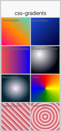
to <side>, linear with mismatched alphas, radial farthest-corner, radial ellipse, conic, repeating-linear, repeating-radial).linear-gradient
Any angle in degrees, radians, or turn, or the canonical to <side> / to <side1> <side2> directions. Two or more stops, each with optional position percentage; positions left blank between fixed anchors are autodistributed:
LinearGradientA { background: linear-gradient(0deg, #cccccc, #666666); }
LinearGradientB { background: linear-gradient(to top, #cccccc, #666666); }
LinearGradientC { background: linear-gradient(45deg, #eaeaea, #666666); }
LinearGradientD { background: linear-gradient(135deg, #ff0080 0%, #ff8c00 50%, #40e0d0 100%); }
LinearGradientE { background: linear-gradient(to bottom right, #ff0066, #000033); }
LinearGradientF { background: linear-gradient(90deg, rgba(255, 0, 0, 0.6), blue); }
radial-gradient
Full CSS radial syntax: circle or ellipse, any of the four extent keywords (closest-side / closest-corner / farthest-side / farthest-corner, defaulting to farthest-corner), explicit radii as percentages, an optional at <position> clause with side keywords or percentages, and two or more multi-stop colors:
RadialGradientA { background: radial-gradient(circle, gray, white); }
RadialGradientB { background: radial-gradient(ellipse closest-side at 25% 75%, #ffffff, #000000); }
RadialGradientC { background: radial-gradient(circle farthest-corner at right, #ffffee, #006666 60%, #000011 100%); }
conic-gradient
Sweep / pie-style gradient. Optional from <angle> (CSS convention: 0° points up, sweep is clockwise) and at <position> prefix, followed by the stop list:
ConicGradientA { background: conic-gradient(red, yellow, green, blue, red); }
ConicGradientB { background: conic-gradient(from 45deg at 50% 50%, #ff0066 0%, #ffcc00 25%, #00cc66 50%, #0066ff 75%, #ff0066 100%); }
repeating-linear-gradient / repeating-radial-gradient
Identical syntax to their non-repeating counterparts. The stop pattern tiles outward to fill the bounding box, ideal for stripes and rings:
MyStripe { background: repeating-linear-gradient(45deg, #eeeeee 0%, #eeeeee 10%, #cccccc 10%, #cccccc 20%); }
MyTarget { background: repeating-radial-gradient(circle at center, #ffffff 0%, #ffffff 20%, #cc3333 20%, #cc3333 40%); }
filter and backdrop-filter
CSS filter and backdrop-filter accept a chain of functions. Two storage forms land on the corresponding Style:
blur(<length>)→filterBlurRadius/backdropFilterBlurRadius(a single pixel value).brightness,contrast,grayscale,hue-rotate,invert,opacity,saturate,sepia→filterColorMatrix/backdropFilterColorMatrix(a 4×5 color matrix; a multi-function chain composes into a single matrix in CSS order):
MyOverlay {
    background: rgba(0, 0, 0, 0.4);
    backdrop-filter: blur(12px);
}

MyBlurredImage {
    filter: blur(4px);
}

MyFaded {
    filter: brightness(0.7) contrast(1.15);
}

MyGrayscale {
    filter: grayscale(1);
}

MySepia {
    filter: sepia(0.8) saturate(1.1);
}
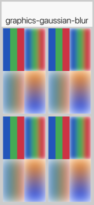
filter: blur() applied at a graphics primitive level — the framework’s screenshot test renders RGB stripes and a gradient, then blurs both via Graphics.gaussianBlur(…). Component-level paint-time integration of filter: declarations is in progress; until it lands, set the radius / matrix on a Style and consume them via the corresponding Graphics primitives manually.filter applies to the component’s own painted content; backdrop-filter applies to whatever is painted behind. The radii / matrices are also exposed on Style (getFilterBlurRadius(), getFilterColorMatrix(), getBackdropFilterBlurRadius(), getBackdropFilterColorMatrix()) so they can be set programmatically. Hardware blur is used where available (Core Image on iOS, RenderScript/RenderEffect on Android, JHLabs GaussianFilter on JavaSE simulator); ports without a fast path fall back to a software Gaussian.
cn1-background-type
It also supports some special Codename One values, which are identifiers with a "cn1-" prefix. The following special values are available. They map to the standard Codename One values you discussed in the theming chapter:
cn1-image-scaledcn1-image-scaled-fillcn1-image-scaled-fitcn1-image-tile-bothcn1-image-tile-valign-leftcn1-image-tile-valign-centercn1-image-tile-valign-rightcn1-image-tile-halign-topcn1-image-tile-halign-centercn1-image-tile-halign-bottomcn1-image-align-bottomcn1-image-align-leftcn1-image-align-rightcn1-image-align-centercn1-image-align-top-leftcn1-image-align-top-rightcn1-image-align-bottom-leftcn1-image-align-bottom-rightcn1-image-bordercn1-nonecn1-round-bordercn1-pill-border
Images
Images are supported as both "inputs" of the stylesheet, and as outputs to the compiled resource file. "Input" images are specified via the background-image property in a selector. "Output" images are always saved as multi-images inside the resource file.
Image DPI and device densities
To appropriately size the image, the CSS compiler needs to know what the source density of the image is. For example, if an image is 160×160 pixels with a source density of 160dpi (that is, medium density - or the same as an iPhone 3G), then the resulting multi-image will be sized at 160×160 for medium density devices and 320×320 on high density devices (for example, iPhone 4S Retina) - which will result in the same perceived size to the user of 1×1 inch.
However, if the image has a source density of 320dpi, then the resulting multi-image would be 80×80 pixels on medium density devices and 160×160 pixels on high density devices.
Some images have this density information embedded in the image itself so that the CSS processor will know how to resize the image. But, it’s better to explicitly document your intentions by including the cn1-source-dpi property as follows:
SomeStyle {
    background-image: url(images/my-image.png);
    cn1-source-dpi: 160;
}
cn1-source-dpi values are meant to fall into threshold ranges. Values less than or equal to 120, are interpreted as low density. 121 - 160 are medium density (iPhone 3GS). 161 - 320, high density (iPhone 4S). 321 - 480 == HD. 481 and higher == 2HD. In general, you should try to use images that are one of these DPIs exactly: 160, 320, or 480, then images will be scaled up or down to the other densities accordingly.Multi-Images vs regular images
By default all images are imported as multi-images (unless you define the defaultSourceDPIInt theme constant). If you want to import an image as a "regular" image, you can set cn1-source-dpi to 0. For example:
SomeStyle {
    background-image: url(images/my-image.png);
    cn1-source-dpi: 0;
}
You can change the default source DPI for the whole stylesheet by adding defaultSourceDPIInt: 0 to the theme constants. For example:
#Constants {
  defaultSourceDPIInt: 0;
}
Most application templates in Codename One Initializr include this constant by default.
Multi-Images as inputs
If you’ve already generated images in all the appropriate sizes for all densities, you can provide them in the same file structure used by the Codename One XML resource files: The image path is a directory that contains images named after the density that they’re intended to be used for. The possible names include:
verylow.pnglow.pngmedium.pnghigh.pngveryhigh.png560.pnghd.png2hd.png4k.png
For example, Given the CSS directives:
MyStyle {
    background-image: url(images/mymultiimage.png);
}
The files would look like:
css/
 +--- mycssfile.css
 +--- images/
       +--- mymultiimage.png/
             +--- verylow.png
             +--- low.png
             +--- medium.png
... etc.http://) urls with multi-image inputsImage constants
Theme constants can be images. The convention is to suffix the constant name with "Image" so that it will be treated as an image. Also to the standard url() notation for specifying a constant image, you can provide a simple string name of the image, and the CSS processor will try to find an image by that name specified as a background image for one of the styles. If it can’t find one, it will look inside a special directory named "res" (located in the same directory as the CSS stylesheet), inside which it will look for a directory named the same as the stylesheet, inside which it will look for a directory with the specified multi-image. This directory structure is the same as used for Codename One’s XML resources directory.
For example, In the CSS file "mycssfile.css":
radioSelectedFocusImage: "Radio_btn_Press.png";
Will look for a directory located at res/mycssfile.css/Radio_btn_Press.png/ with the following images:
verylow.pnglow.pngmedium.pnghigh.pngveryhigh.png560.pnghd.png2hd.png4k.png
It will then create a multi-image from these images and include them in the resource file.
Image recipes
Import multiple images in single selector
It’s quite useful to be able to embed images inside the resource file that’s generated from the CSS stylesheet so that you can access the images using the Resources.getImage() method in your app and set it as an icon on a button or label. In this case, it’s easier to create a dummy style that you don’t intend to use and include multiple images in the background-image property like so:
Images {
    background-image: url(images/NowLogo.png),
        url(images/Username-icon.png),
        url(images/Password-icon.png),
        url(images/Name-icon.png),
        url(images/Email-icon.png),
        url(images/SeaIce.png),
        url(images/Back-icon.png),
        url(images/Source-icon.png),
        url(images/Date-icon.png),
        url(images/Arrow-right.png),
        url(images/Share-icon.png),
        url(images/Text-icon.png),
        url(images/Comments-icon.png),
        url(images/RedPlanet.png),
        url(images/News-icon.png),
        url(images/Channels-icon.png),
        url(images/Bookmarks-icon.png),
        url(images/Overview-icon.png),
        url(images/Calendar-icon.png),
        url(images/Timeline-icon.png),
        url(images/Profile-icon.png),
        url(images/Widgets-icon.png),
        url(images/Settings-icon.png),
        url(images/Bookmark-icon.png);
}
Then in Java, you might do something like:
Resources theme = Resources.openLayered("/theme");

Label bookmark = new Label(theme.getImage("Bookmark-icon.png"));
Loading images from URLs
You can also load images from remote URLs. The compiled guide fixture uses a local asset so the build is deterministic and doesn’t depend on network access; application CSS can use the same url(…) syntax with an HTTPS URL:
ImagesRemote {
    background-image: url(images/remote-logo.png);
}
Generating 9-Piece Image borders
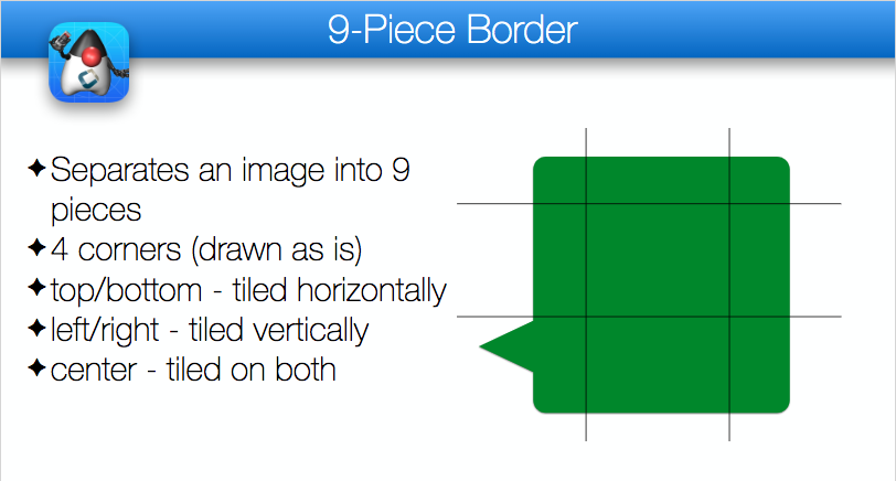
9-Piece image borders can be created using the image-border and image-border-slice properties.
For example:
NinePiece {
    border-image: url(images/dashbg_landscape.png);
}
In the above example you omitted the border-image-slice property, so it defaults to "40%," which means that the image is sliced 40% from the top, 40% from the bottom, 40% from the left, and 40% from the right.
If you want more specific "slice" points, you can add the border-image-slice property. For example:
NinePiece {
    border-image: url(images/dashbg_landscape.png);
    border-image-slice: 10% 49%;
}

NinePiece2 {
    border-image: url(images/dashbg_landscape.png);
    border-image-slice: 10% 49% 20%;
}

NinePiece3 {
    border-image: url(images/dashbg_landscape.png);
    border-image-slice: 10% 30% 40% 20%;
}

NinePiece4 {
    border-image: url(images/dashbg_landscape.png);
    border-image-slice: 10%;
}
Image backgrounds
Component backgrounds in Codename One are a common source of confusion for newcomers because there are 3 different properties that can be used to define what a component’s background looks like, and they have priorities:
Background Color - You can specify an RGB color to be used as the background for a component.
Background Image - You can specify an image to be used as the background for a component. Codename One includes settings to define how the image is treated, for example, scale/fill, tile, etc. If a background image is specified, it will override the background color setting - unless the image has transparent regions.
Image Border - You can define a 9-piece image border which will effectively cover the entire background of the component. If an image border is specified, it will override the background image of the component.
A common scenario you may run into is trying to set the background color of a component and seeing no change when you preview the form, because the style had an image background defined - which overrides the background color change.
The potential for confusion is mitigated somewhat, but still exists when using CSS. You can make your intentions explicit by adding the cn1-background-type property to your style. Possible values include:
cn1-image-scaledcn1-image-scaled-fillcn1-image-scaled-fitcn1-image-tile-bothcn1-image-tile-valign-leftcn1-image-tile-valign-centercn1-image-tile-valign-rightcn1-image-tile-halign-topcn1-image-tile-halign-centercn1-image-tile-halign-bottomcn1-image-align-bottomcn1-image-align-leftcn1-image-align-rightcn1-image-align-centercn1-image-align-top-leftcn1-image-align-top-rightcn1-image-align-bottom-leftcn1-image-align-bottom-rightcn1-image-bordercn1-nonenone
Example setting background Image to scale fill
MyContainer {
    background-image: url(images/myimage.png);
    cn1-background-type: cn1-image-scaled-fill;
}
Image compression
CN1 resource files support both PNG and JPEG images, but PNG is the default. Multi-images that are generated by the CSS compiler will be PNG if they include alpha transparency, and JPEG otherwise. This is to try to reduce the file size as much as possible while not sacrificing quality.
Fonts
This library supports the font, font-size, font-family, font-style, font-weight, and text-decoration properties, as well as the @font-face CSS "at" rule for including TrueType and OpenType fonts.
font-family
By default, CN1’s native fonts are used. The appropriate native font is selected for the provided font-weight and font-style properties. You can also explicitly specify the native font you wish to use in the font-family property. For example:
SideCommand {
    font-family:  "native:MainThin";
}
If you omit the font-family directive altogether, it will use native:MainRegular. The following native fonts are available:
native:MainThinnative:MainLightnative:MainRegularnative:MainBoldnative:MainBlacknative:ItalicThinnative:ItalicLightnative:ItalicRegularnative:ItalicBoldnative:ItalicBlack
Using bundled fonts
If you want to use a font other than the built-in fonts, you’ll need to define the font using the @font-face rule. For example:
@font-face {
    font-family: "GuideDemoFont";
    src: url(res/GuideDemoFont-Regular.ttf);
}
Both TrueType (.ttf) and OpenType (.otf) files work, upper-case or lower-case. Every platform loads both formats through its own font API, so an OpenType font needs no conversion before you bundle it. Web-only formats such as .woff aren’t supported, and the CSS compiler fails the build on one rather than letting it reach the device.
Then you’ll be able to reference the font using the specified font-family in any CSS element. For example:
MyLabel {
    font-family: "GuideDemoFont";
}
Where to put the font file
A relative src URL is resolved against the directory that holds the CSS file. You can keep font files directly beside theme.css, or in any subdirectory of it, whichever you prefer:
@font-face {
    font-family: "GuideRootFont";
    src: url(GuideRootFont.ttf);
}

@font-face {
    font-family: "GuideDemoFont Bold";
    src: url(res/GuideDemoFont-Bold.ttf);
}
The font does have to live somewhere under that directory, because only that directory is copied into the build. A font reached through ../, or one that doesn’t exist, fails the build rather than producing an app whose text falls back to the system font. Two @font-face rules naming different files that share a file name also fail, since fonts are deployed by file name alone and one would overwrite the other. Pointing two families at the same file is fine.
Family names, weights and styles
A font-family name that contains spaces must be quoted, both in the @font-face rule and wherever you reference it. An unquoted name is parsed as a list of separate identifiers, so font-family: GuideDemoFont Bold registers the family as GuideDemoFont and collides with your regular weight.
font-weight and font-style select between the built-in native: fonts, but they have no effect once font-family resolves to a @font-face rule. Declare one @font-face per weight and style you need, each with its own family name, as in the example above, then reference the right family from each UIID.
To change the base font of an entire theme, set font-family on the special Default selector, then override the UIIDs that need a bold or italic face:
Default {
    font-family: "GuideRootFont";
}

Title {
    font-family: "GuideDemoFont Bold";
}
Remote and GitHub-hosted fonts
The @font-face directive’s src property will accept both local and remote URLs. The guide fixture below uses a local font so the demo build remains offline and repeatable; application CSS can replace the URL with an HTTPS font URL:
@font-face {
    font-family: "GuideDownloadedFont";
    src: url(res/GuideDemoFont-Regular.ttf);
}
In this case, it will download the myfont.ttf file into the build directory alongside the merged CSS file, and reuse that copy on later builds so that it doesn’t have to make a network request every time. A mvn clean discards the cache and the next build downloads the font again.
Fonts are automatically copied next to the compiled theme.res when the CSS file is compiled, so that they’re distributed with the app and available at runtime. The copy uses the font’s file name only, which means two @font-face rules that point at identically named files in different directories will collide. The copy is also skipped when a file of that name is already there, so run mvn clean after you replace a font file with a different one of the same name.
GitHub URLs
Fonts hosted on GitHub are accessible using a special github: protocol to make it easier to reference such fonts. The compiled guide fixture uses a bundled icon font for offline validation; application CSS can use the same rule shape with a github: URL.
@font-face {
    font-family: "GuideIconFont";
    src: url(res/GuideIconFont.ttf);
}
font-size
It’s best practice to size your fonts using millimetres (rem) (or another "real-world" measurement unit such as inches (in), centimetres (cm), millimetres (mm). This will allow the font to be sized appropriate for all display densities. If you specify size in pixels (px), it will treat it the same as if you sized it in points (pt), where 1pt == 1/72 inches (one seventy-second of an inch).
If you size your font in percentage units (for example, 150%) it will set the font size relative to the medium font size of the platform. This is different than the standard behaviour of a web browser, which would size it relative to the parent element’s font size.
font-size: 150% is the same as font-size: 1.5rem.You can use system fonts, true type fonts, and native fonts in your CSS stylesheet. True Type fonts need to be defined in a @font-face directive before they can be referenced. True-type fonts and native fonts have the advantage that you can specify their sizes in generic terms (for example, small, medium, large) and in more specific units such as millimeters (mm) or pixels (px).
text-decoration
Some sample CSS directives
@font-face {
    font-family: "GuideDemoFont";
    src: url(res/GuideDemoFont-Regular.ttf);
}

@font-face {
    font-family: "GuideDemoFont-Bold";
    src: url(res/GuideDemoFont-Bold.ttf);
}

PlainText0p5mm { font-size: 0.5mm; }
PlainText1mm { font-size: 1mm; }
PlainText2mm { font-size: 2mm; }
PlainText5mm { font-size: 5mm; }
PlainText10mm { font-size: 10mm; }
PlainText50mm { font-size: 50mm; }
PlainTextSmall { font-size: small; }
PlainTextMedium { font-size: medium; }
PlainTextLarge { font-size: large; }
PlainText3pt { font-size: 3pt; }
PlainText6pt { font-size: 6pt; }
PlainText12pt { font-size: 12pt; }
PlainText20pt { font-size: 20pt; }
PlainText36pt { font-size: 36pt; }

BoldText { font-weight: bold; }
BoldText1mm { font-weight: bold; font-size: 1mm; }
BoldText2mm { font-weight: bold; font-size: 2mm; }
BoldText3mm { font-weight: bold; font-size: 3mm; }
BoldText5mm { font-weight: bold; font-size: 5mm; }

ItalicText { font-style: italic; }
ItalicText3mm { font-style: italic; font-size: 3mm; }
ItalicBoldText { font-style: italic; font-weight: bold; }

PlainTextUnderline { text-decoration: underline; }
BoldTextUnderline { text-decoration: underline; font-weight: bold; }
ItalicTextUnderline { text-decoration: underline; font-style: italic; }

PlainText3d {
    text-decoration: cn1-3d;
    color: white;
    background-color: #3399ff;
}

BoldText3d {
    text-decoration: cn1-3d;
    font-weight: bold;
    color: white;
    background-color: #3399ff;
}

ItalicText3d {
    text-decoration: cn1-3d;
    font-style: italic;
    color: white;
    background-color: #3399ff;
}

PlainText3dLowered {
    text-decoration: cn1-3d-lowered;
    color: black;
    background-color: #3399ff;
}

BoldText3dLowered {
    text-decoration: cn1-3d-lowered;
    font-weight: bold;
    color: black;
    background-color: #3399ff;
}

ItalicText3dLowered {
    text-decoration: cn1-3d-lowered;
    font-style: italic;
    color: black;
    background-color: #3399ff;
}

PlainText3dShadow {
    text-decoration: cn1-3d-shadow-north;
    color: white;
    background-color: #3399ff;
}

BoldText3dShadow {
    text-decoration: cn1-3d-shadow-north;
    font-weight: bold;
    color: white;
    background-color: #3399ff;
}

ItalicText3dShadow {
    text-decoration: cn1-3d-shadow-north;
    font-style: italic;
    color: white;
    background-color: #3399ff;
}

MainThin {
    font-size: 200%;
    background: radial-gradient(circle at top left, yellow, blue 100%);
}

MainRegular0001 {
    font-family: "native:MainRegular";
    color: blue;
    border: 1px cn1-pill-border blue;
    padding: 2mm;
}

MainRegular0001.pressed {
    font-family: "native:MainRegular";
    background: cn1-pill-border blue;
    color: white;
    border: 1px solid white;
    padding: 2mm;
}

Heading {
    font-size: 4mm;
    font-family: "GuideDemoFont-Bold";
    color: black;
    padding: 2mm;
    text-align: center;
}
Media queries
You can use media queries to target styles to specific platforms, devices, and device densities. The following media queries are supported:
platform-xxx- Target a specific platform. For example,platform-and,platform-ios,platform-mac,platform-win.density-xxx- Target a specific device density. For example,density—low,density-low,density-medium,density-high,density—high,density-hd,density-2hd, anddensity-560.device-xxx- Target a specific device type. For example,device-desktop,device-tablet,device-phone,device-tv(Apple TV / Android TV), anddevice-watch(Apple Watch / Wear OS). Thedevice-tvanddevice-watchvariants are selected at runtime whenDisplay.isTV()/Display.isWatch()returnstrue, letting you adapt styling for the 10-foot TV UI or the small wearable screen.
Also to the Codename One specific media tokens above, the CSS compilers also recognize standard dark-mode media queries using prefers-color-scheme: dark. Rules inside these blocks are compiled into $Dark UIIDs automatically (for example, Button becomes $DarkButton, Button.selected becomes $DarkButton.selected).
Button {
    color: #222222;
}

@media (prefers-color-scheme: dark) {
    Button {
        color: #f0f0f0;
        background-color: #000000;
    }

    Button.selected {
        color: #ff0000;
    }
}Label {
color: black;
}
@media platform-and {
Label {
color: green;
}
}
@media platform-ios {
Label {
color: red;
}
}Label {
color: black;
}
@media density-very-low, density-low, density-medium, density-high {
Label {
color: green;
}
}
@media density-very-high, density-h2, density-2hd, density-560 {
Label {
color: red;
}
}Label {
color: black;
}
@media device-desktop {
Label {
color: green;
}
}
@media device-tablet, device-phone {
Label {
color: red;
}
}Display.getPlatformName(), which is used for other ports. When running on Android, then, the platform will be "and." When running on iOS, the platform will be "ios." Etc.Compound media queries
You can combine multiple media queries together, separated by a comma. Queries of the same type are "OR"ed together. Queries of different types are "AND"ed together. For example if you have a media query that specifies two different device densities (for example, density-low and density-high) the query will match both devices with low density and high density. But, if the query specifies a device density and a platform (for example, density-low and platform-and), then it will match a device if it matches the platform and the density.
@media platform-and, density-high {
    Label {
        color: green;
    }
}@media platform-ios, density-high, density-low {
Label {
color: red;
}
}@media device-desktop, platform-mac {
Label {
color: blue;
}
}Order or precedence
The order of precedence when applying styles differs slightly from the way styles would be applied in standard CSS. The order of precedence is as follows:
Styles defined inside
@mediablocks will always take precedence over styles defined outside of@mediablocks.@mediablocks with more query matches will take precedence over blocks with fewer query matches. For example, A media block matching density, platform, and device will take precedence over a block that only matches the density and platform.If the same style is defined in two media blocks which contain the same number of query matches, then the order precedence is
platform,device,densityin decreasing order. That is, the block that matches on platform will take precedence over the block that matches on density.If the same style is defined in two media blocks with identical query matches, then the order of precedence is undefined.
Font scaling constants
Sometimes you may find that fonts are coming out too large or too small across the board on certain types of devices. You can use standard media queries to customize font sizes, but you can also use font-scaling constants to scale font sizes for the entire stylesheet based on platform, device, and/or density. Sometimes you may find this approach easier.
For example, consider the following simple stylesheet that defines a font size of 2mm on labels:
Label {
 font-size: 3mm;
}
During testing, perhaps you find that, on desktop, the fonts are a little bit too small. In this case, you can apply a font-scale constant that only applies to the desktop:
#Constants {
 device-desktop-font-scale: "1.5";
}

Label {
 font-size: 3mm;
}
Now, on most devices the Label style will have 3mm fonts. However, on desktop, it will have 4.5mm fonts.
The above would be equivalent to:
Label {
 font-size: 3mm;
}

@media device-desktop {
 Label {
 font-size: 4.5mm;
 }
}
#Constants {
 device-phone-font-scale: "1.5";
 device-tablet-font-scale: "1.2";
 device-desktop-font-scale: "1.4";
 platform-ios-font-scale: "0.9";
 density-low-font-scale: "1.2";
 platform-ios-density-low-font-scale: "1.3";
}font-scale constants will be applied to the styles. If you define 3 font-scale constants that all match the current runtime environment, they will all be applied. For example, If there are 3 matching font-scale constants with 2.0, 3.0, and 4.0, then fonts will be scaled by 2*3*4=24!