Before getting into CSS, this section introduces a few advanced theme concepts. Those ideas also apply to CSS because CSS uses features such as theme constants.
Working with UIIDs
A UIID (User Interface Identifier) uniquely identifies a group of theme definitions for UI components. For example, a Button UIID can be linked to a component, and the theme can then define that component’s appearance.
A major advantage of UIIDs is the ability to change a component’s UIID. For example, to create a multiline label, use code like this:
TextArea t = new TextArea(); // ...
t.setUIID("Label");
t.setEditable(false);
UIIDs can be customized in the GUI builder and support per-component styling.
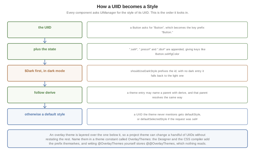
Looking a UIID up isn’t a single lookup. The state, the appearance and any
derive chain each get a turn before the default style is reached:
Theme layering
Theme layering helps in two common cases:
A platform needs a slightly different theme.
A specific use case needs theme customization. For example, a user might select larger fonts.
Theme layering is straightforward and doesn’t require rebuilding the entire theme. A theme can be applied on top of another theme, like CSS cascading. To create a layer, add a new theme with the Add Theme button.
includeNativeBool constant from the new theme.In the new theme, define the changes you need. For example, to use a larger default font, define that property for the relevant UIIDs and leave the other properties unchanged.
In a non-GUI-builder app, the theme loading code looks like this by default:
Resources theme = UIManager.initFirstTheme("/theme");
Update it to look like this:
Resources theme = UIManager.initNamedTheme("/theme", "Theme");
Theme, not the layer theme that was added.The original code relies on the theme being at position 0 in the theme name array. That might not always be true.
To add the theme layer, use:
UIManager.getInstance().addThemeProps(theme.getTheme("NameOfLayerTheme"));
The addThemeProps call places the secondary theme on top of the primary "Theme" and keeps the original UIIDs in "Theme" intact.
To apply theme changes to a running application, call Form’s `refreshTheme(). This updates the UI and provides visual feedback for the theme changes.
Override resources in platform
When you adapt an application to different OS conventions, one common need is to use different icons. Sometimes you also need to change behavior based on device type, for example to use a different UI structure for a tablet.
Codename One lets you override a resource for a specific platform. You can redefine a resource for that platform and add platform-specific resources.
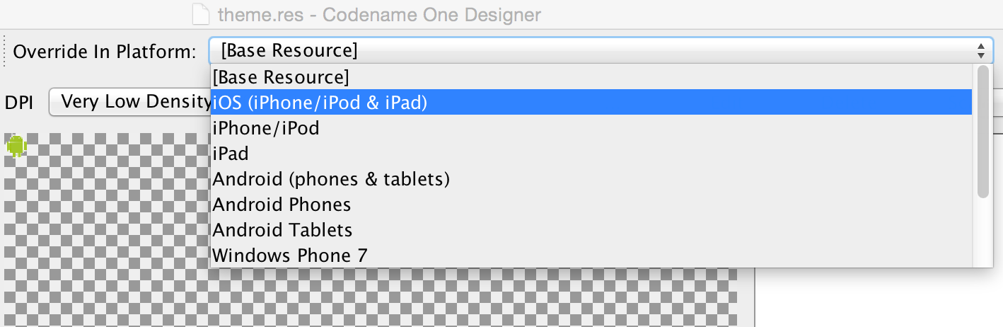
Overridden resources take precedence over embedded resources, which lets you change the look or even behavior for a specific platform or OS.
To override a resource, select the platform where the override applies.
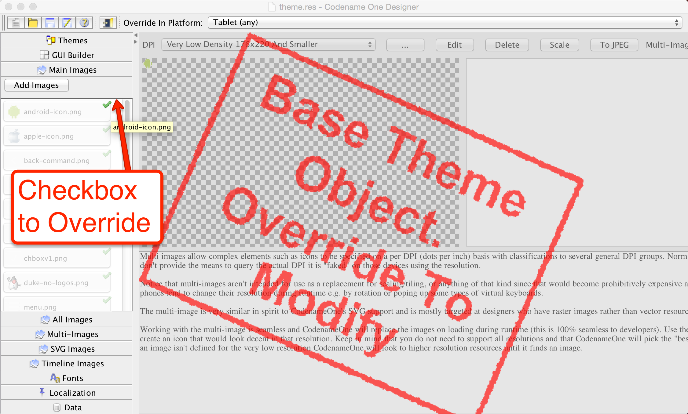
You can then click the green checkbox to mark that resource as specific to this platform. All resources added while that platform is selected apply to that platform. If you change your mind, delete the override in override mode and it will stop applying.
Theme constants
The Codename One Designer has a tab for creating constants. These constants can add global values and behavior hints to Codename One and its components. Constants are always strings. Some conventions let the UI adapt to input types. For example, a constant that ends with Bool is treated as a boolean value and displays as a checkbox. An Int suffix displays a numeric picker, and an Image suffix shows a combo box for picking an image.
To use a constant, call the appropriate UIManager methods:
getThemeConstantisThemeConstantgetThemeImageConstant
Internally, Codename One has many built-in constants, and the list keeps growing. As features are added, the list is updated, but theme constants are inherently ad hoc and some may not appear here.
| Constant | Description/Argument |
|---|---|
alwaysTensileBool | Enables tensile drag even when there is no scrolling in the container (only for scrollable containers) |
backGestureThresholdInt | The threshold for the back gesture in the SwipeBackSupport class, defaults to 5 |
backUsesTitleBool | Indicates to the GUI builder that the back command should use the title of the previous form and not just the word "Back" |
buttonRippleBool |
|
capsButtonTextBool |
|
capsButtonUiids | A list of the UIID’s that should be capitalized by default (in supported platforms) other than the |
defaultCommandImage | Image to give a command with no icon |
defaultNativeWindowModeBool |
|
dialogButtonCommandsBool | Place commands in the dialogs as buttons |
dialogBlurRadiusInt | Sets the default Gaussian blur radius for the background of the dialogs. The default value is -1 indicating no blur |
dialogPosition | Place the dialog in an arbitrary border layout position (for example, North, South, Center, etc.) |
centeredPopupBool | Popup of the combo box will appear in the center of the screen |
changeTabOnFocusBool | Useful for feature phones, allows changing the tab when the focus changes, without pressing a key |
checkBoxCheckDisImage | CheckBox image to use instead of Codename One drawing it on its own |
checkBoxCheckedImage | CheckBox image to use instead of Codename One drawing it on its own |
checkBoxOppositeSideBool | Indicates the check box should be drawn on the opposite side to the text and not next to the text |
checkBoxUncheckDisImage | CheckBox image to use instead of Codename One drawing it on its own |
checkBoxUncheckedImage | CheckBox image to use instead of Codename One drawing it on its own |
comboImage | Combo image to use instead of Codename One drawing it on its own |
commandBehavior | Deprecated: don’t use this constant as it conflicts with the |
ComponentGroupBool | Enables component group, which allows components to be logically grouped together, so the UIID’s of components would be modified based on their group placement. This allows for some unique styling effects where the first/last elements have different styles from the rest of the elements. It’s disabled by default, thus leaving its usage up to the designer |
dialogTransitionIn | Default transition for dialog |
dialogTransitionInImage | Default transition Image for dialog, causes a Timeline transition effect |
dialogTransitionOut | Default transition for dialog |
defaultCommandImage | An image to place on a command if none is defined, only applies to touch commands |
defaultEmblemImage | The emblem painted on the side of the multibutton, by default this is an arrow on some platforms |
emblemUiid | Overrides the UIID applied to emblem labels rendered by composite buttons such as |
iconUiid | Allows theming the icon component used by |
iosScrollMotionBool | Enables iOS-style scroll physics (nonlinear rubber-band during drag and critically damped tensile snap-back). When unset it defaults to |
imageviewerNavigationArrowsBool | Enables side navigation arrows by default for |
imageviewerThumbnailBarHeightMM | Sets the default thumbnail strip height (in millimeters) for |
imageviewerThumbnailsBool | Enables the bottom thumbnail strip by default for |
textUiid | Overrides the text component UIID for |
useLargerTextScaleBool | When |
dialogTransitionOutImage | Default transition Image for dialog, causes a Timeline transition effect |
DecayMotionScaleFactorInt | Velocity-to-distance multiplier for the exponential-decay scroll motion (see Scroll motion tuning). Default is |
disabledColor | Color to use when disabling entries by default |
dlgButtonCommandUIID | The UIID used for dialog button commands |
dlgCommandButtonSizeInt | Minimum size to give to command buttons in the dialog |
dlgCommandGridBool | Places the dialog commands in a grid for uniform sizes |
dlgInvisibleButtons | Includes an RRGGBB color for the line separating dialog buttons, as is the case with Android 4 and iOS 7 buttons in dialogs |
dlgSlideDirection | Slide hints |
dlgSlideInDirBool | Slide hints |
dlgSlideOutDirBool | Slide hints |
drawMapPointerBool | Indicates whether a pointer should appear in the center of the map component |
fadeScrollBarBool | Boolean indicating if the scrollbar should fade when there is inactivity |
setFadeScrollBarSpeed(int) (API) | Sets the per-frame opacity decrement for scrollbar fading (not milliseconds). Approximate fade duration is |
fadeScrollEdgeBool | Places a fade effect at the edges of the screen to show that it’s possible to scroll until you reach the edge (common on Android) |
fadeScrollEdgeInt | Amount of pixels to fade out at the edge |
firstCharRTLBool | Indicates to the GenericListCellRenderer that it should determine RTL status based on the first character in the sentence |
noTextModeBool | Indicates that the on/off switch in iOS shouldn’t draw text on top of the switch, which is the case for iOS 7+ but not for prior versions |
fixedSelectionInt | Number corresponding to the fixed selection constants in List |
formTransitionIn | Default transition for form |
formTransitionInImage | Default transition Image for form, causes a Timeline transition effect |
formTransitionOut | Default transition for form |
formTransitionOutImage | Default transition Image for form, causes a Timeline transition effect |
globalToobarBool | Indicates that the Toolbar API should be on/off by default for all forms |
hasRaisedButtonBool | Is true in platforms where the theme has the |
hideBackCommandBool | Hides the back command from the side menu when possible |
hideEmptyTitleBool | Indicates that a title with no content should be hidden even if the border for the title occupies space |
hideLeftSideMenuBool | Hides the side menu icon that appears on the left side of the UI |
hideRightSideMenuBool | Hides the toolbar menu icon that appears on the right side of the title area |
ignorListFocusBool | Hide the focus component of the list when the list doesn’t have focus |
infiniteImage | The image used by the infinite progress component, the component will rotate it as needed |
infiniteMaterialDesignSize | Size (in millimeters) of the generated material design spinner when |
infiniteMaterialImageSize | Size (in millimeters) of the generated spinner image when no custom |
infiniteDefaultColor | Hex RGB color used for the autogenerated material spinner when |
interactionDialogSpeedInt | Controls the duration in milliseconds that |
includeNativeBool | True to derive from the platform native theme, false to create a blank theme that only uses the basic defaults |
labelGap | Positive floating point value representing the default gap value between the label text and the icon in millimeters |
listItemGapInt | Built-in item gap in the list, this defaults to 2, which predated padding/margin in Codename One |
listLongPressBool | Indicates whether a list should handle long press events, defaults to true |
mapTileLoadingImage | An image to preview while loading the MapComponent tile |
mapTileLoadingText | The text of the tiles in the MapComponent during loading, defaults to "Loading…" |
mapZoomButtonsBool | Indicates whether buttons should be drawn on the map component |
mediaBackImage | Media icon used by the media player class |
mediaFwdImage | Media icon used by the media player class |
mediaPauseImage | Media icon used by the media player class |
mediaPlayImage | Media icon used by the media player class |
menuButtonBottomBool | When set to true this flag aligns the menu button to the bottom portion of the title. Defaults to false |
menuButtonTopBool | When set to true this flag aligns the menu button to the top portion of the title. Defaults to false |
landscapeTitleUiidBool | When true the toolbar swaps to landscape-specific UIIDs (such as |
menuHeightPercent | Allows positioning and sizing the menu |
menuImage | The three dot menu image used in Android and the Toolbar to show more command entries |
menuImageSize | The size in millimeters (floating point value) of the generated side menu image, this is only used if you don’t supply a custom image. The default value is 4.5. |
menuPrefSizeBool | Allows positioning and sizing the menu |
menuSlideDirection | Defines menu entrance effect |
menuSlideInDirBool | Defines menu entrance effect |
menuSlideOutDirBool | Defines menu entrance effect |
menuTransitionIn | Defines menu entrance effect |
menuTransitionInImage | Defines menu entrance effect |
menuTransitionOut | Defines menu exit effect |
menuTransitionOutImage | Defines menu entrance effect |
menuWidthPercent | Allows positioning and sizing the menu |
iosStyleBackArrowBool | Renders the back command using the iOS-style chevron arrow (with a small icon gap) when the toolbar shows back text |
minimizeOnBackBool | Indicates whether the form should minimize the entire application when the physical back button is pressed (if available) and no command is defined as the back command. Defaults to true |
onOffIOSModeBool | Indicates whether the on/off switch should use the iOS or Android mode |
otherPopupRendererBool | Indicates that a separate renderer UIID/instance should be used to the list within the combo box popup |
PackTouchMenuBool | Enables preferred sized packing of the touch menu (true by default), when set to false this allows manually determining the touch menu size using percentages |
paintsTitleBarBool | Indicates that the StatusBar UIID should be added to the top of the form to space down the title area, as is the case on iOS 7+ where the status bar is painted on top of the UI |
rightSideMenuImage | Overrides the default icon used for the right-side toolbar menu button |
rightSideMenuPressImage | Optional pressed-state icon for the right-side toolbar menu button |
popupCancelBodyBool | Indicates that a cancel button should appear within the combo box popup |
PopupDialogArrowBool | Indicates whether the popup dialog has an arrow, notice that this constant will change if you change UIID of the popup dialog |
PopupDialogArrowBottomImage | Image of the popup dialog arrow, notice that this constant will change if you change UIID of the popup dialog |
PopupDialogArrowTopImage | Image of the popup dialog arrow, notice that this constant will change if you change UIID of the popup dialog |
PopupDialogArrowLeftImage | Image of the popup dialog arrow, notice that this constant will change if you change UIID of the popup dialog |
PopupDialogArrowRightImage | Image of the popup dialog arrow, notice that this constant will change if you change UIID of the popup dialog |
popupNoTitleAddPaddingInt | Adds padding to a popup when no title is present |
popupTitleBool | Indicates that a title should appear within the combo box popup |
pullToRefreshImage | The arrow image used to draw the |
pureTouchBool | Indicates the pure touch mode |
radioOppositeSideBool | Indicates the radio button should be drawn on the opposite side to the text and not next to the text |
radioSelectedDisImage | Radio button image |
radioSelectedImage | Radio button image |
radioUnselectedDisImage | Radio button image |
radioUnselectedImage | Radio button image |
radioSelectedDisFocusImage | Radio button image |
radioSelectedFocusImage | Radio button image |
radioUnselectedDisFocusImage | Radio button image |
radioUnselectedFocusImage | Radio button image |
releaseRadiusInt | Indicates the distance from the button with dragging, in which the button should be released, defaults to 0 |
rendererShowsNumbersBool | Indicates whether renderers should render the entry number |
reverseSoftButtonsBool | Swaps the softbutton positions |
rightSideMenuImage | Same as sideMenuImage only for the right side, optional and defaults to sideMenuImage |
rightSideMenuPressImage | Same as sideMenuPressImage only for the right side, optional and defaults to sideMenuPressImage |
rubberBandCoefficientInt | Resistance coefficient for the iOS-style rubber-band compression used while the finger drags past a scroll edge. Value is interpreted as hundredths, so |
ScrollMotion | Selects the post-release flick model. |
ScrollMotionTimeConstantInt | Time constant in milliseconds for the exponential-decay flick model (active when |
scrollVisibleBool |
|
showBackCommandOnTitleBool | Used by the Toolbar API to show whether the back button should appear on the title |
shrinkPopupTitleBool | Indicates the title of the popup should be set to 0 if it’s missing |
sideMenuAnimSpeedInt | The speed at which a sidemenu moves defaults to 300 milliseconds |
sideMenuFoldedSwipeBool | Indicates the side menu could be opened via swiping |
sideMenuImage | The image representing the side menu, three lines (Hamburger menu) |
sideMenuPressImage | Optional pressed version of the sideMenuImage |
sideMenuScrollVisibleBool | Indicates whether the scroll bar on the side menu should be visible or not, defaults to hidden |
sideMenuShadowBool | Indicates whether the shadow for the side menu should be drawn |
sideMenuShadowImage | The image used when drawing the shadow (a default is used if this isn’t supplied) |
sideMenuSizeTabPortraitInt | The size of the side menu when expanded in a tablet in portrait mode |
sideMenuSizePortraitInt | The size of the side menu when expanded in a phone in portrait mode |
sideMenuSizeTabLandscapeInt | The size of the side menu when expanded in a tablet in landscape mode |
sideMenuSizeLandscapeInt | The size of the side menu when expanded in a phone in landscape mode |
sideMenuTensileDragBool | Enables/disables the tensile drag behavior within the opened side menu |
sideSwipeActivationInt | Indicates the threshold in the side menu bar at which a swipe should trigger activation, defaults to 15 (percent) |
sideSwipeSensitiveInt | Indicates the region of the screen that’s sensitive to side swipe in the side menu bar, defaults to 10 (percent) |
sigButtonOKUIID | Defines the UIID applied to the confirmation button in the signature capture dialog (defaults to |
sigButtonResetUIID | Defines the UIID applied to the reset/clear button in the signature capture dialog (defaults to |
sigButtonCancelUIID | Defines the UIID applied to the cancel button in the signature capture dialog (defaults to |
slideDirection | Default slide transition settings |
slideInDirBool | Default slide transition settings |
slideOutDirBool | Default slide transition settings |
sliderThumbImage | The thumb image that can appear on the sliders |
snapGridBool | Snap to grid toggle |
statusBarScrollsUpBool | Indicates that a tap on the status bar should scroll up the UI, only relevant in OSes where paintsTitleBarBool is true |
switchButtonPadInt | Indicates the padding in the on/off switch, defaults to 16 |
switchMaskImage | Indicates the mask image used in iOS mode to draw on top of the switch |
switchOnImage | Indicates the on image used in iOS mode to draw the on/off switch |
switchOffImage | Indicates the off image used in iOS mode to draw the on/off switch |
TabEnableAutoImageBool | Indicates images should be filled by default for tabs |
TabSelectedImage | Default selected image for tabs (if TabEnableAutoImageBool=true) |
TabUnselectedImage | Default unselected image for tabs (if TabEnableAutoImageBool=true) |
tabPlacementInt | The placement of the tabs in the Tabs component: TOP = 0, LEFT = 1, BOTTOM = 2, RIGHT = 3 |
tabsSlideSpeedInt | The time of the animation that occurs (in milliseconds) between releasing a swiped tab and reaching the next tab. Defaults to 200 |
tabsFillRowsBool | Indicates if the tabs should fill the row using flow layout |
tabsGridBool | Indicates whether tabs should use a grid layout thus forcing all tabs to have identical sizes |
tabsOnTopBool | Indicates the tabs should be drawn on top of their content in a layered UI, this allows a tab to intrude into the content of the tabs |
textCmpVAlignInt | The vertical alignment of the text component: TOP = 0, CENTER = 4, BOTTOM = 2 |
textComponentErrorColor | A hex RGB color which defaults to null in which case this has no effect. When defined this will change the color of the border and label to the given color to match the material design styling. This implements the red border underline in cases of error and the label text color change |
textComponentOnTopBool | Toggles the on top mode which makes things look like they do on Android. This defaults to true on Android and false on other OSes. This can also be manipulated via the |
textComponentAnimBool | toggles the animation mode which again can be manipulated by a method in |
textComponentFieldUIID | sets the UIID of the text field to something other than |
textFieldCursorColorInt | The color of the cursor as an integer (not hex) |
tickerSpeedInt | The speed of label/button etc. (in milliseconds) |
tintColor | The aarrggbb hex color to tint the screen when a dialog is shown |
topMenuSizeTabPortraitInt | The size of the side menu when expanded and attached to the top in a tablet in portrait mode |
topMenuSizePortraitInt | The size of the side menu when expanded and attached to the top in a phone in portrait mode |
topMenuSizeTabLandscapeInt | The size of the side menu when expanded and attached to the top in a tablet in landscape mode |
topMenuSizeLandscapeInt | The size of the side menu when expanded and attached to the top in a phone in landscape mode |
touchCommandFillBool | Indicates how the touch menu should lay out the commands within |
touchCommandFlowBool | Indicates how the touch menu should lay out the commands within |
transitionSpeedInt | Indicates the default speed for transitions |
treeFolderImage | Picture of a folder for the Tree class |
treeFolderOpenImage | Picture of a folder expanded for the |
treeNodeImage | Picture of a file node for the |
tensileDragBool | Indicates that tensile drag should be enabled/disabled. This is set by platform themes |
tensileSnapMinDurationInt | Minimum duration in milliseconds for the tensile snap-back animation when the finger is released past a scroll edge. Defaults to |
tensileSnapMotion | Motion curve used for the tensile snap-back. |
Scroll motion tuning
Scroll feel is controlled by three stages, each tunable via theme constants:
While the finger is dragging past an edge--when
iosScrollMotionBoolistrue, the over-edge distance is compressed by the iOS UIScrollView rubber-band functionc * d * dim / (c * d + dim), wheredis the raw finger displacement past the edge,dimis the viewport dimension, andcisrubberBandCoefficientInt / 100(default0.55). The result is that the content feels heavier the farther you pull it, asymptotically approachingdim. WheniosScrollMotionBoolisfalse, the legacy behavior is used: a linear 1:1 follow clamped totensileLength.After the finger is lifted, while there is still velocity--the
ScrollMotionconstant selects the model.DECAY(default) uses exponential velocity decay with a time constant ofScrollMotionTimeConstantIntmilliseconds and a distance scale ofDecayMotionScaleFactorInt. Any other value (for example,FRICTION) falls back to linear friction.When the scroll comes to rest past an edge--a tensile snap-back animates the content back to the edge.
tensileSnapMotionpicks the curve:SPRINGis a critically damped envelope (iOS-like soft settle) andDECELERATIONis the legacy quadratic ease-out. The duration scales with distance but never falls belowtensileSnapMinDurationIntmilliseconds.iosScrollMotionBoolis the single switch that flips stage 1 and the default of stage 3 to the iOS-matching behavior. It defaults totrueon the iOS platform only. Every individual constant can still be overridden regardless of this switch, so you can, for example, enable the nonlinear rubber-band globally (iosScrollMotionBool=true) while keeping the legacy quadratic snap-back (tensileSnapMotion=DECELERATION).
To make scrolling feel stiffer on iOS (less pull), reduce
rubberBandCoefficientIntfrom55toward35.To make flicks stop sooner, reduce
ScrollMotionTimeConstantInt(default500) orDecayMotionScaleFactorInt(default950).To enable iOS-style physics on Android or desktop for consistency, set
iosScrollMotionBool=trueexplicitly.To disable iOS physics on the simulator while debugging, set
iosScrollMotionBool=falsein your development theme.
Native theming
Codename One uses a theme constant called includeNativeBool, when that constant is set to true Codename One starts by loading the native theme first and then applying all the theme settings. This means your theme "derives" the style of the native theme first, like the cascading effect of CSS. Internally this is what the theme layering section covered.
By avoiding this flag you can create themes that look EXACTLY the same on all platforms.
You can simulate different OS platforms by using the native theme menu option
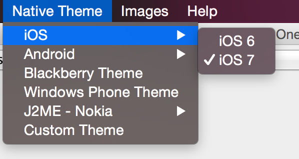
Developers can pick the platform of their liking and see how the theme will appear in that particular platform by selecting it and having the preview update on the fly.
Under the hood of the theme engine
To truly understand a theme you need to understand what it is. Internally a theme is a Hashtable key/value pair between UIID based keys and their respective values. For example: the key:
return "Button.fgColor=ffffff";
Will set the foreground color of the Button UIID to white.
When a Codename One Component is instantiated it requests a Style object from the UIManager class. The Style object is based on the settings within the theme and can be modified through code or by using the theme.
You can replace the theme dynamically in runtime and refresh the styles assigned to the various components using the refreshTheme() method.
refreshTheme() without actually changing the theme. You see developers doing it when all they need is a repaint() or revalidate(). Since refreshTheme() is ** expensive recommend that you don’t use it unless you need to…A theme Hashtable key comprises:
[UIID.][type#]attribute
The UIID, corresponds to the component’s UIID for example: Button, CheckBox etc. It’s optional and may be omitted to address the global default style.
The type is omitted for the default unselected type, and may be one of sel (selected type), dis (disabled type) or press (pressed type). The attribute should be one of:
derive- the value for this attribute should be a string representing the base component.bgColor- represents the background color for the component, if applicable, in a web hex string format RRGGBB for example: ff0000 for red.fgColor- represents the foreground color, if applicable.border- an instance of the border class, used to display the border for the component.bgImage- an Image object used in the background of a component.transparency- aStringcontaining a number between 0-255 representing the alpha value for the background. This applies to the bgColor.margin- the margin of the component as aStringcontaining 4 comma separated numbers for top, bottom, left, right.padding- the padding of the component, it has an identical format to the margin attribute.font- A Font object instance.alignment- anIntegerobject containing the LEFT/RIGHT/CENTER constant values defined in Component.textDecoration- anIntegervalue containing one of the TEXT_DECORATION_* constant values defined in Style.backgroundType- aByteobject containing one of the constants for the background type defined in Style under BACKGROUND_*.backgroundGradient- contains anObjectarray containing 2 integers for the colors of the gradient. If the gradient is radial it contains 3 floating points defining the x, y & size of the gradient.
To set the foreground color of a selected button to red, a theme will define a property like:
Button.sel#fgColor=ff0000
This information is useful for understanding how things work within Codename One, but it can also be useful in runtime.
For example: to increase the size of all fonts in the application, you can do something like:
Hashtable h = new Hashtable();
h.put("font", largeFont);
UIManager.getInstance().addThemeProps(h);
Display.getInstance().getCurrent().refreshTheme();
Understanding images and Multi-Images
When working with a theme, you often use images for borders or backgrounds. You also use images within the GUI for various purposes and most such images will be extracted from the resource file.
Adding a standard JPEG/PNG image to the resource file is straight forward, and the resulting image can be viewed within the images section. For example, due to the wide difference between device types, an image that would be appropriate in size for an iPhone 3gs would not be appropriate in size for a Nexus device or an iPhone 4 (but perhaps, it will be right for iPad 1 and iPad 2).
The density of the devices varies and Codename One tries to simplify the process by unifying everything into one set of values to show density. For simplicity’s sake, density is sometimes expressed in pixels, but it’s mapped internally to actual screen measurements where possible.
A multi-image is an image that has many varieties for different densities, and thus looks sharp in all the densities. Since scaling on the device can’t interpolate the data (due to performance considerations), significant scaling on the device becomes impractical. For example, a multi-image will provide the "right" resolution image for the given device type.
From the programming perspective this is seamless, a developer accesses one image and has no ability to access the images in the different resolutions. Within the designer, but, you can explicitly define images for many resolutions and perform high quality scaling so the "right" image is available.
You can use two basic methods to add a multi-image: quick add and standard add.
Both methods rely on understanding the source resolution of the image, for example: if you have an icon that you expect to be 128×128 pixels on iPhone 4, 102×102 on nexus one and 64×64 on iPhone 3gs. You can provide the source image as the 128 pixel image and perform a quick add option while picking the # High# density option.
This will show to the algorithm that your source image is designed for the " high" density and it will scale for the rest of the densities accordingly.
Or, you can use the standard add multi-image dialog and set it like this:
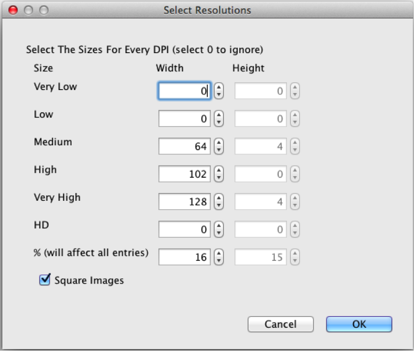
Notice that you selected the square image option, essentially eliminating the height option. Setting values to 0 prevents the system from generating a multi-image entry for that resolution, which will mean a device in that category will fall on the closest alternative.
The percentage value will change the entire column, and it means the percentage of the screen. For example: You know the icon is 128 for the high resolution, you can move the percentage until you reach something close to 128 in the " High" row and the other rows will represent a size that should be pretty close in physical size to the 128 figure.
At runtime, you can always find the host device’s approximate pixel density using the Display.getDeviceDensity()
method. This will return one of:
Constant | Density | Example Device |
| ~ 88 ppi | |
| ~ 120 ppi | Android ldpi devices |
| ~ 160 ppi | iPhone 3GS, iPad, Android mdpi devices |
| ~ 240 ppi | Android hdpi devices |
| ~ 320 ppi | iPhone 4, iPad Air 2, Android xhdpi devices |
| ~ 540 ppi | iPhone 6+, Android xxhdpi devices |
| ~ 750 ppi | Android xxxhdpi devices |
| ~ 1000 ppi | |
| ~ 1250ppi |
Use millimeters for Padding/Margin and font sizes
When configuring your styles, you should rarely use "Pixels" as the unit for padding, margins, font size, and border thickness because the results will be inconsistent on different densities. Instead, you should use millimeters for all non-zero units of measurement.
As you now understand the complexities of DPI it should be clear why this is important.
Fractions of millimeters
Sometimes millimeters don’t give you enough precision for what you want to do. The designer allows you to specify integer values for most units. For example, you can achieve more precise results when working directly in Java. The Display.convertToPixels() method will allow you to convert millimeters (or DIPS) to pixels. It also takes an integer input, but you can use it to get a multiplier that you can then use to convert any millimeter value you want into pixels.
For example:
double pixelsPerMM = ((double) Display.getInstance().convertToPixels(10, true)) / 10.0;
And now you can set the padding on an element to 1.5mm. For example:
myButton.getAllStyles().setPaddingUnit(Style.UNIT_TYPE_PIXELS);
int pixels = (int) (1.5 * pixelsPerMM);
myButton.getAllStyles().setPadding(pixels, pixels, pixels, pixels);
Creating a great looking side menu
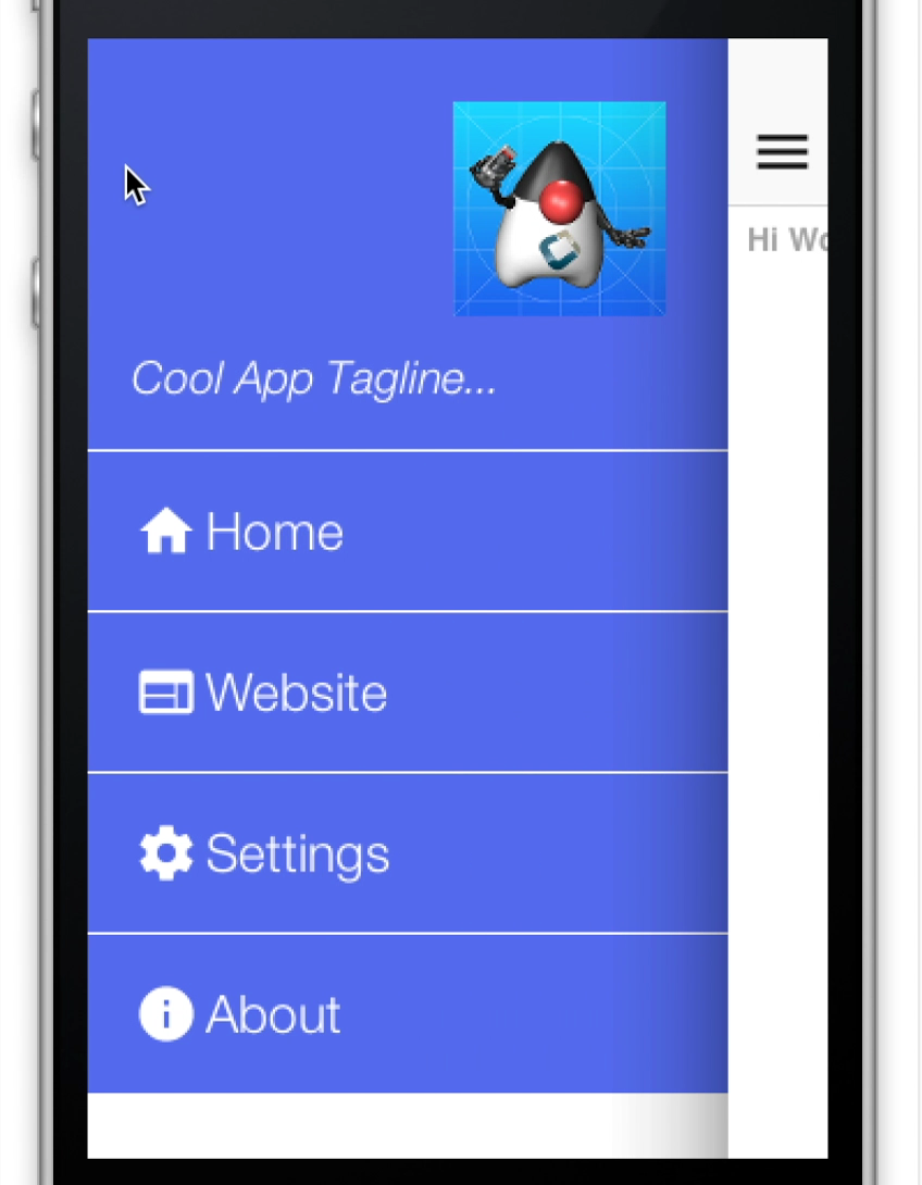
A side menu is a crucial piece of an elegant application. You will explain how one creates a simple side menu that’s elegant, portable and easy to build. This is a good "starting point" side menu from which you can build more elaborate designs.
To get this result you will start from a native theme and a bare-bones application to keep things simple.
The code for the side menu is this:
Form hi = new Form("Hi World");

Toolbar tb = hi.getToolbar();
Image icon = theme.getImage("icon.png"); // (1)
Container topBar = BorderLayout.east(new Label(icon));
topBar.add(BorderLayout.SOUTH, new Label("Cool App Tagline...", "SidemenuTagline")); // (2)
topBar.setUIID("SideCommand");
tb.addComponentToSideMenu(topBar);

tb.addMaterialCommandToSideMenu("Home", FontImage.MATERIAL_HOME, e -> {}); // (3)
tb.addMaterialCommandToSideMenu("Website", FontImage.MATERIAL_WEB, e -> {});
tb.addMaterialCommandToSideMenu("Settings", FontImage.MATERIAL_SETTINGS, e -> {});
tb.addMaterialCommandToSideMenu("About", FontImage.MATERIAL_INFO, e -> {});

hi.addComponent(new Label("Hi World"));
hi.show();
This is the icon which was used instead of a logo it appears in the top right of the side menu
This is the top bar containing the tagline and the icon it’s styled as if it’s a command but you can put anything here for example: an image etc.
The commands are added as usual to the side menu with no styling or functionality, the entire look is determined by the theme
Next you will open the designer tool to style the UI
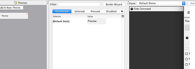
Now when you press Add the side menu entries will appear in the combo box (you can type them but this is more convenient). You will start with the SideNavigationPanel style:
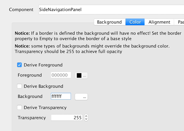
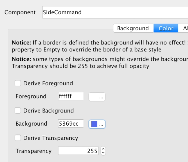
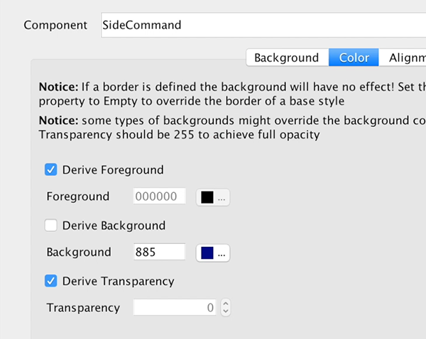
The SideCommand style is a bit more elaborate, you start with a white foreground and an opaque bluish/purple color:
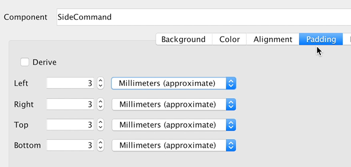
You will set padding to 3 millimeters which provides everything a good feel and spacing. This is important for finger touch sensitivity.
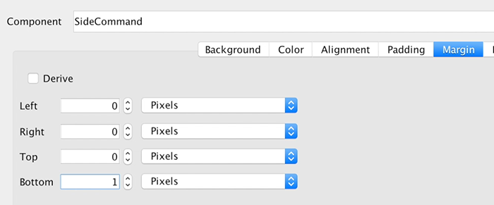
You will set margin to 0 except for the bottom one pixel which will leave a nice white line by showing off the background. This means the commands will have a space between them and the white style you gave to the SideNavigationPanel will appear through that space.
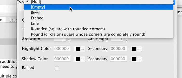
Setting the border to empty is crucial!
The iOS version of the side command inherits a border style so you must "remove" it by defining a different border in this case an empty border. Since borders take precedence over color this would have prevented the color changes you made from appearing.
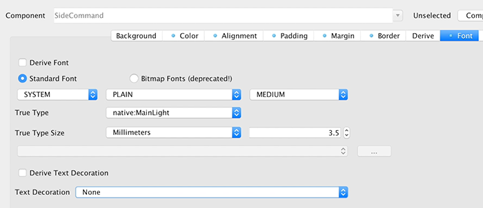
Next you need to pick a good looking font and make sure it’s large enough. You use millimeters size it for all OS’s and override the derived text decoration which has a value in the iOS native theme so it can impact the final look.
Next you need to move to the selected tab and add a new side command entry that derives from the unselected version. You will pick a new color that’s slightly deeper and will make the selected style appear selected. You will also copy and paste this selected style to the pressed style.

The SidemenuTagline is a SideCommand style that was slightly adapted. You will remove the padding and margin because the whole section is wrapped in a side command and you don’t want double padding. You will leave 1mm padding at the top for a bit of spacing from the logo.
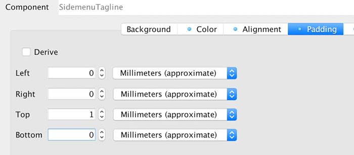
You will also update the font to a smaller size and italic styling so it will feel like a tagline.
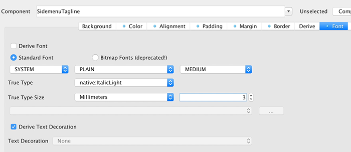
The last change for the theme is for the StatusBarSideMenu UIID which is a spacing on the top of the sidemenu. This spacing is there for iOS devices which render the clock/battery/reception symbols on top of the app. You will set the padding to 0.
Finally, you will add the icon image (or a logo if you have it) into the theme as a multi image so you can use it within the side menu as a good looking logo. A large icon image works as a 2HD multi-image but you can use many strategies to get a fitting image for this spot.
These steps produce the UI above as a side menu, they might seem like a long set of steps but each step is pretty simple as you walk through each one. This does show off the versatility and power of Codename One as a change to one step can create a radically different UI design.
From a design to a theme
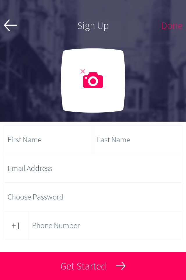
A design usually arrives as a mock-up from someone who doesn’t write apps, and the work is the same whichever tool it came out of: decide which components and layout managers reproduce the structure, export the images you need at the densities you need, and then style it.
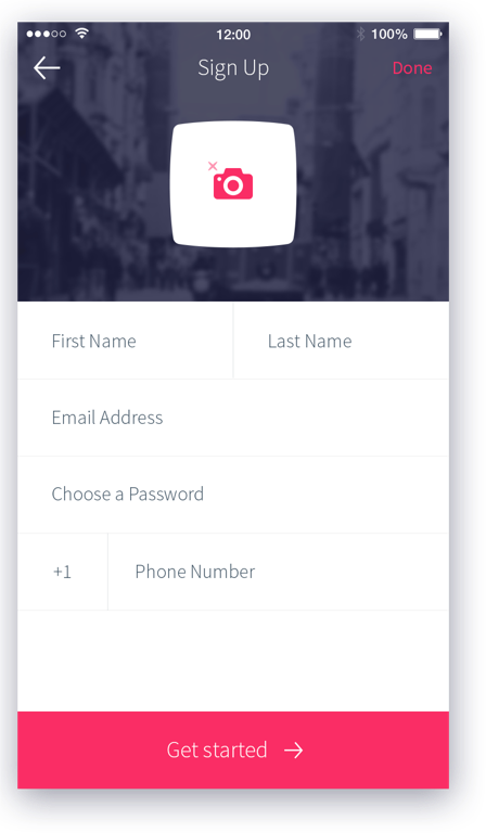
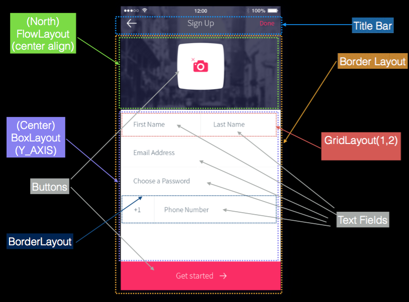
The structure is the part worth doing on paper first. Nesting containers to match the design, rather than positioning things absolutely, is what keeps it working across screen sizes and platforms:
Export the artwork the design needs before writing the code. This one needs three pieces: the header background, and the camera icon with the round button it sits on.
 Figure 201. The header background |  Figure 202. The camera icon |  Figure 203. The button behind it |
Only images a stylesheet names reach the compiled theme, and the camera pieces
are fetched by name at runtime rather than used as a background, so the theme
below carries a selector that exists purely to import them. Each is declared at
its source density so the compiler produces a multi-image and every screen gets
an appropriately sized file, which is what theme.getImage then returns.
That hierarchy is ordinary component code. The code below builds the form, starting with a separator the design uses between fields:
private Label createSeparator() {
    Label sep = new Label();
    sep.setUIID("Separator");
    // the separator line  is implemented in the theme using padding and background color, by default labels
    // are hidden when they have no content, this method disables that behavior
    sep.setShowEvenIfBlank(true);
    return sep;
}
if (current != null) {
    current.show();
    return;
}
// The toolbar uses the layered mode so it resides on top of the background image, the theme makes
// it transparent so we will see the image below it, we use border layout to place the background image on
// top and the "Get started" button in the south
Form psdTutorial = new Form("Signup", new BorderLayout());
Toolbar tb = new Toolbar(true);
psdTutorial.setToolbar(tb);

// we create 4mm material arrow images for the back button and the Get started button
Style iconStyle = psdTutorial.getUIManager().getComponentStyle("Title");
FontImage leftArrow = FontImage.createMaterial(FontImage.MATERIAL_ARROW_BACK, iconStyle, 4);
FontImage rightArrow = FontImage.createMaterial(FontImage.MATERIAL_ARROW_FORWARD, iconStyle, 4);

// we place the back and done commands in the toolbar, we need to change UIID of the "Done" command
// so we can color it in Red
tb.addCommandToLeftBar("", leftArrow, (e) -> Log.p("Back pressed"));
Command doneCommand = tb.addCommandToRightBar("Done", null, (e) -> Log.p("Done pressed"));
tb.findCommandComponent(doneCommand).setUIID("RedCommand");

// The camera button is comprised of 3 pieces. A label containing the image and the transparent button
// with the camera icon on top. This is all wrapped in the title container where the title background image
// is placed using the theme. We chose to use a Label rather than a background using the cameraLayer so
// the label will preserve the original size of the image without scaling it and take up the space it needs
Button cameraButton = new Button(theme.getImage("camera.png"));
Container cameraLayer = LayeredLayout.encloseIn(
        new Label(theme.getImage("camera-button.png")),
        cameraButton);
cameraButton.setUIID("CameraButton");
Container titleContainer = Container.encloseIn(
        new BorderLayout(BorderLayout.CENTER_BEHAVIOR_CENTER),
        cameraLayer, BorderLayout.CENTER);
titleContainer.setUIID("TitleContainer");

TextField firstName = new TextField("", "First Name");
TextField lastName = new TextField("", "Last Name");
TextField email = new TextField("", "Email Address", 20, TextField.EMAILADDR);
TextField password = new TextField("", "Choose a Password", 20, TextField.PASSWORD);
TextField phone = new TextField("", "Phone Number", 20, TextField.PHONENUMBER);
Label phonePrefix = new Label("+1");
phonePrefix.setUIID("TextField");

// The phone and full name have vertical separators, we use two table layouts to arrange them correctly
// so the vertical separator will be in the right place
TableLayout fullNameLayout = new TableLayout(1, 3);
Container fullName = new Container(fullNameLayout);
fullName.add(fullNameLayout.createConstraint().widthPercentage(49), firstName).
        add(fullNameLayout.createConstraint().widthPercentage(1), createSeparator()).
        add(fullNameLayout.createConstraint().widthPercentage(50), lastName);
Container fullPhone = TableLayout.encloseIn(3, phonePrefix, createSeparator(), phone);

// The button in the south portion needs the arrow icon to be on the right side so we place the text on the left
Button southButton = new Button("Get started", rightArrow);
southButton.setTextPosition(Component.LEFT);
southButton.setUIID("SouthButton");

// we add the components and the separators the center portion contains all of the elements in a box
// Y container which we allow to scroll. BorderLayout Containers implicitly disable scrolling
Container by = BoxLayout.encloseY(
        fullName,
        createSeparator(),
        email,
        createSeparator(),
        password,
        createSeparator(),
        fullPhone,
        createSeparator()
);
by.setScrollableY(true);
psdTutorial.add(BorderLayout.NORTH, titleContainer).
        add(BorderLayout.SOUTH, southButton).
        add(BorderLayout.CENTER, by);

psdTutorial.show();
Style it with CSS. Ten UIIDs cover this design, and every value in it maps to an
ordinary CSS property: the scaled header image is cn1-background-type, a UIID
that only varies a color inherits the rest with cn1-derive, and the pressed
and selected states are the .pressed and .selected classes rather than
separate definitions. Sizes are in millimetres so they hold their physical size
across densities.
TitleContainer {
    background-image: url(images/background.jpg);
    cn1-background-type: cn1-image-scaled-fill;
    cn1-source-dpi: 320;
    padding: 8mm 3mm 2mm 3mm;
    margin: 0;
}

/* The camera artwork is fetched by name at runtime rather than set as a
   background, so it needs a selector to get it into the theme at all. This one
   is never applied to anything; naming the images here is what bundles them. */
PsdImages {
    background-image: url(images/camera.png),
        url(images/camera-button.png);
    cn1-source-dpi: 320;
}

Title {
    background-color: transparent;
    color: #ffffff;
    font-family: "native:MainThin";
    font-size: 3.5mm;
    padding: 1mm;
    margin: 0;
    border: none;
}

TitleCommand {
    cn1-derive: Title;
}

RedCommand, RedCommand.pressed, RedCommand.selected {
    cn1-derive: Title;
    color: #f73267;
    font-family: "native:MainLight";
    font-size: 3mm;
}

TitleArea {
    background-color: transparent;
    padding: 0;
    margin: 0;
    border: none;
}

TextField, TextField.selected {
    background-color: #ffffff;
    font-family: "native:MainLight";
    font-size: 2mm;
    padding: 2mm;
    margin: 0;
    border: none;
}

TextHint {
    cn1-derive: TextField;
    color: #4d606f;
}

SouthButton, SouthButton.pressed, SouthButton.selected {
    background-color: #f73267;
    color: #ffffff;
    text-align: center;
    font-family: "native:MainThin";
    font-size: 3mm;
    padding: 2mm 1mm 2mm 1mm;
    margin: 0;
}

CameraButton, CameraButton.pressed, CameraButton.selected {
    background-color: transparent;
    text-align: center;
    padding: 3mm 1mm 1mm 1mm;
    margin: 1mm;
}

/* The separator is an empty Label, so the line is the style: a background
   colour and just enough padding to give it height. */
Separator {
    background-color: #f5f5f5;
    padding: 0.2mm 0 0 0;
    margin: 1mm 0 1mm 0;
    border: none;
}
That’s the whole theme. With it in place the same code produces the design: