Codename One components are lightweight: they’re painted by Codename One instead of being represented by a native widget on every platform. The accessibility semantics API builds an explicit, immutable virtual tree from those components and presents it to VoiceOver, TalkBack, Windows UI Automation, AT-SPI, Java Access Bridge, and web accessibility APIs.
The semantic tree is separate from the visual tree. This is important for renderer-backed controls, merged cards, decorative content, custom controls, and applications that need a reading order different from paint order.
Built-in semantics
Standard components work without extra configuration. Button, CheckBox, RadioButton, Slider, text fields, lists, tables, tabs, labels, dialogs, and containers infer appropriate roles, values, states, collection metadata, and standard actions. Renderer-backed List rows are exposed as stable virtual children even though no Component exists for each painted row.
Component.setAccessibilityText() remains supported. It’s a compatibility alias for the semantic label. New code should use getSemantics() when it needs more than a label.
Button save = new Button("Save");
save.getSemantics()
        .setHint("Saves the edited profile")
        .setIdentifier("profile-save");
Changes to text, selection, focus, enabled state, bounds, scrolling, ranges, tabs, and the current Form automatically invalidate the native semantic tree. Custom components should call accessibilityChanged() after a semantic value changes outside a standard setter.
Roles, names, values, and state
AccessibilityRole contains portable control roles including buttons, toggle buttons, switches, checkboxes, radio buttons, headings, links, images, text and search fields, sliders, progress indicators, lists, grids, rows, cells, headers, tabs, dialogs, alerts, menus, toolbars, combo boxes, trees, and separators. A port maps an unsupported role to the closest native role without discarding its label or state.
wifiSwitch.getSemantics()
        .setRole(AccessibilityRole.SWITCH)
        .setLabel("Wi-Fi")
        .setChecked(AccessibilityCheckedState.CHECKED)
        .setEnabled(Boolean.TRUE)
        .setHint("Double tap to turn Wi-Fi off");
title.getSemantics() .setHeadingLevel(2) .setIdentifier("network-heading");
Tri-state controls use UNCHECKED, CHECKED, or MIXED. Nullable Boolean properties distinguish an explicit state from an unspecified state. Available properties include selected, expanded, enabled, invalid, busy, read-only, required, multiline, obscured, pressed, and current. setValidationError() supplies both the error message and invalid state. setPaneTitle() describes a newly displayed pane or screen, and setModal(true) identifies a modal scope.
Use setRoleDescription() only when the platform role isn’t sufficiently specific. Localize labels, hints, descriptions, errors, pane titles, role descriptions, and custom action labels.
Ranges and editable values
AccessibilityRange describes minimum, maximum, current value, increment, and an optional spoken value. The spoken value is useful for ranges such as ratings and durations where a raw number is ambiguous.
rating.getSemantics()
        .setRole(AccessibilityRole.SLIDER)
        .setLabel("Rating")
        .setRange(new AccessibilityRange(0, 5, 3, 1, "3 out of 5"));
Editable controls can provide SET_VALUE or SET_TEXT actions. Sliders and other adjustable controls should expose INCREMENT and DECREMENT. Standard components infer these actions.
Custom accessibility actions
An AccessibilityAction has a stable ID, a localized label, an enabled state, and a handler. Handlers always execute on the Codename One EDT, including when the action originates on a native accessibility thread.
card.getSemantics().addAction(new AccessibilityAction(
        "archive",
        "Archive message",
        new AccessibilityAction.Handler() {
            public boolean perform(Component component, Object argument) {
                archiveMessage();
                return true;
            }
        }
));
Use the standard IDs in AccessibilityAction for activation, long press, increment, decrement, set value, set text, selection, character or word cursor movement, focus, show-on-screen, dismiss, expand, collapse, scrolling, and clipboard operations. A custom ID must be stable and its label must not be null.
Grouping and virtual descendants
AccessibilityGrouping controls how a component participates in the semantic tree:
AUTOuses normal component inference.LEAFexposes the component but none of its descendants.GROUPexposes the component as a semantic container and retains its descendants.MERGE_DESCENDANTScombines descendant labels, descriptions, values, state, and actions into one node.EXCLUDEremoves the component but promotes its descendants to the semantic parent.EXCLUDE_SUBTREEremoves the component and all descendants.
summaryCard.getSemantics()
        .setRole(AccessibilityRole.GENERIC)
        .setGrouping(AccessibilityGrouping.MERGE_DESCENDANTS);
For content that’s painted without child components, attach an AccessibilityChildProvider, or add standalone AccessibilityNode children. Every virtual node must use a stable virtualKey. Stable keys preserve native focus while rows are updated or recycled.
chart.getSemantics().setChildProvider(new AccessibilityChildProvider() {
    public List<AccessibilityNode> getAccessibilityChildren(Component owner) {
        List<AccessibilityNode> result = new ArrayList<AccessibilityNode>();
        for (ChartPoint point : points) {
            AccessibilityNode node = new AccessibilityNode("point-" + point.getId());
            node.setRole(AccessibilityRole.IMAGE)
                    .setLabel(point.getLabel())
                    .setValue(point.getFormattedValue())
                    .setBounds(point.getBounds());
            result.add(node);
        }
        return result;
    }
});
Virtual bounds are relative to the owning component. Component nodes use their clipped absolute bounds.
Traversal order
Visual order is the default reading order. setSortKey() assigns an ordered semantic key among siblings. setTraversalBefore() and setTraversalAfter() express a direct relationship when a numeric order would be fragile.
cancel.getSemantics().setSortKey(1);
continueButton.getSemantics().setSortKey(2);
help.getSemantics().setTraversalAfter(continueButton);
Keep traversal relationships within the same semantic parent. The tree builder resolves these constraints deterministically and preserves stable node IDs.
Live regions and screen changes
Set AccessibilityLiveRegion.POLITE for non-urgent updates and ASSERTIVE for errors or urgent status. OFF is the default. Live changes produce the corresponding platform notification or ARIA live update.
status.getSemantics()
        .setRole(AccessibilityRole.ALERT)
        .setLiveRegion(AccessibilityLiveRegion.POLITE);
status.setText("Upload complete");
Form changes and nodes with a pane title produce screen or pane transition notifications. Display.announceForAccessibility() remains available for an exceptional announcement that isn’t represented by persistent UI. Prefer a live region for state that’s visible on screen.
User accessibility preferences
Semantics describe what a control means. Accessibility preferences describe how the user wants the interface presented. Read these preferences through Display or the matching static shortcuts in CN:
| API | Meaning |
|---|---|
| The user requests stronger foreground and background contrast. |
| The user requests labels, shapes, or patterns in addition to color. |
| Returns |
| Nonessential motion should be removed or replaced with an instant or cross-fade change. |
| Blur and translucent surfaces should use an opaque alternative. |
| The system requests a heavier text weight. |
| The operating system is transforming the displayed colors. |
| Switches should include a visible on/off distinction. |
| A screen reader or touch-exploration service is active. |
An unavailable preference returns false; an unavailable color-vision mode returns UNKNOWN. Don’t hide accessibility support behind isScreenReaderEnabled(). A screen reader can start after the application launches, and other assistive technologies consume the same semantic tree.
if (CN.isHighContrastEnabled()) {
    animatedChart.setUIID("HighContrastChart");
}

// Important state always uses text or an icon as well as color. The
// preference is an extra signal, not permission to use color alone.
if (CN.isDifferentiateWithoutColorEnabled()
        || CN.getColorVisionDeficiency() != AccessibilityColorVisionDeficiency.NONE) {
    connectionStatus.setText("Disconnected: action required");
}

if (CN.isReduceMotionEnabled()) {
    animatedChart.putClientProperty("animate", Boolean.FALSE);
}
if (CN.isReduceTransparencyEnabled()) {
    animatedChart.setUIID("OpaqueChart");
}
getColorVisionDeficiency() == NONE as permission to convey information only through color. The setting can be unavailable, a person might not enable a system filter, and contrast can change with lighting and display hardware. Design the default interface with redundant cues, then use preferences for further adaptation.Preference detection uses each platform’s public signals. iOS and macOS expose contrast, differentiate-without-color, motion, transparency, bold text, inversion, grayscale, switch labels, and VoiceOver; Apple doesn’t expose the selected color-filter type, so the deficiency value is UNKNOWN. Android reads high-text contrast, display inversion and color-correction mode, animation scale, font-weight adjustment, and touch exploration. Windows reads High Contrast, client-area animation, and screen-reader settings. Linux detects the GTK HighContrast theme, disabled GTK animation, and ATK bridge activation. JavaScript uses forced-colors, prefers-contrast, prefers-reduced-motion, and prefers-reduced-transparency. The Java SE simulator provides deterministic controls for every portable signal.
Collections
AccessibilityCollectionInfo describes row and column counts, hierarchy, and selection mode. AccessibilityCollectionItemInfo describes row and column index, spans, position and size in a set, nesting level, and header status.
grid.getSemantics().setCollectionInfo(
        new AccessibilityCollectionInfo(20, 3, false,
                AccessibilityCollectionInfo.SELECTION_MULTIPLE));
cell.getSemantics().setCollectionItemInfo( new AccessibilityCollectionItemInfo( 4, 1, 2, 1, 5, 20, 1, false));
Row and column indexes are zero-based. Position and set size are one-based; use -1 when unknown. Lists, tables, tabs, and their items infer this metadata where possible.
Renderer-backed lists keep the full model size in their collection metadata but materialize only the visible rows, a small navigation buffer, and the selected row as virtual children. Forward and backward semantic scroll actions move the window. This keeps accessibility-tree work proportional to the viewport instead of invoking a cell renderer for every row whenever a large list scrolls.
Inspecting and testing semantics
AccessibilityInspector returns an immutable snapshot. A snapshot is safe to inspect without racing native accessibility callbacks and includes stable IDs, hierarchy, bounds, resolved state, actions, range and collection data. toJson() is suitable for diagnostic reports and tooling.
Semantic setters always mark the cached tree dirty. Pull-based native ports rebuild it on the Codename One EDT only while assistive technology is active or when a tool explicitly requests a snapshot; the browser keeps its off-screen ARIA projection synchronized continuously. Applications should still publish complete semantics unconditionally—this runtime optimization is transparent to application code.
AccessibilityTreeSnapshot tree =
        AccessibilityInspector.snapshot(myForm);
AccessibilityAssertions.assertNoErrors(tree); AccessibilityAssertions.assertNoUnlabeledInteractiveNodes(tree);
String diagnosticJson = tree.toJson(); AccessibilityNodeSnapshot hit = tree.getNodeAt(screenX, screenY);
AccessibilityAssertions.audit() reports machine-readable AccessibilityIssue values for unlabeled controls, invalid ranges, duplicate identifiers or actions, invalid collection positions, missing parents, cycles, unnamed dialogs, and unlabeled custom actions. Warnings also identify suspicious role/state combinations and empty bounds.
The Java SE Component Inspector provides Copy Accessibility Tree JSON and Audit Accessibility Tree actions. Tests should assert resolved semantic properties instead of platform-specific spoken sentences. The scripts/hellocodenameone suite contains the cross-port conformance fixture used by native CI.
Diagnosing and correcting an inaccessible screen
Accessibility review works best as a repeatable loop instead of a final checklist:
Use the keyboard to reach every operation. Verify visible focus, logical order, escape from modal UI, and operation without pointer gestures.
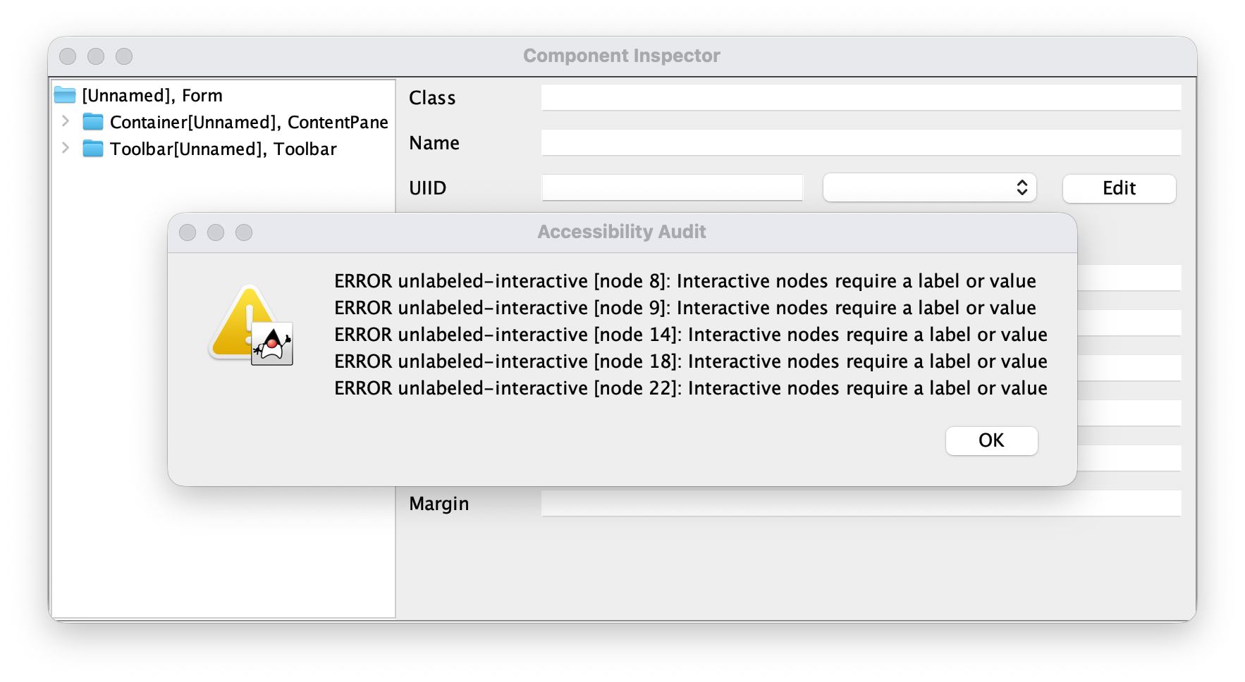
Open Tools → Component Inspector. Select the form or a suspicious component, then choose Audit Accessibility Tree. Start with errors, such as an unlabeled interactive node, invalid range, or unnamed dialog.
Choose Copy Accessibility Tree JSON and inspect the resolved role, label, value, state, actions, bounds, and child order. This catches cases where the visual component hierarchy doesn’t match the virtual accessibility hierarchy.
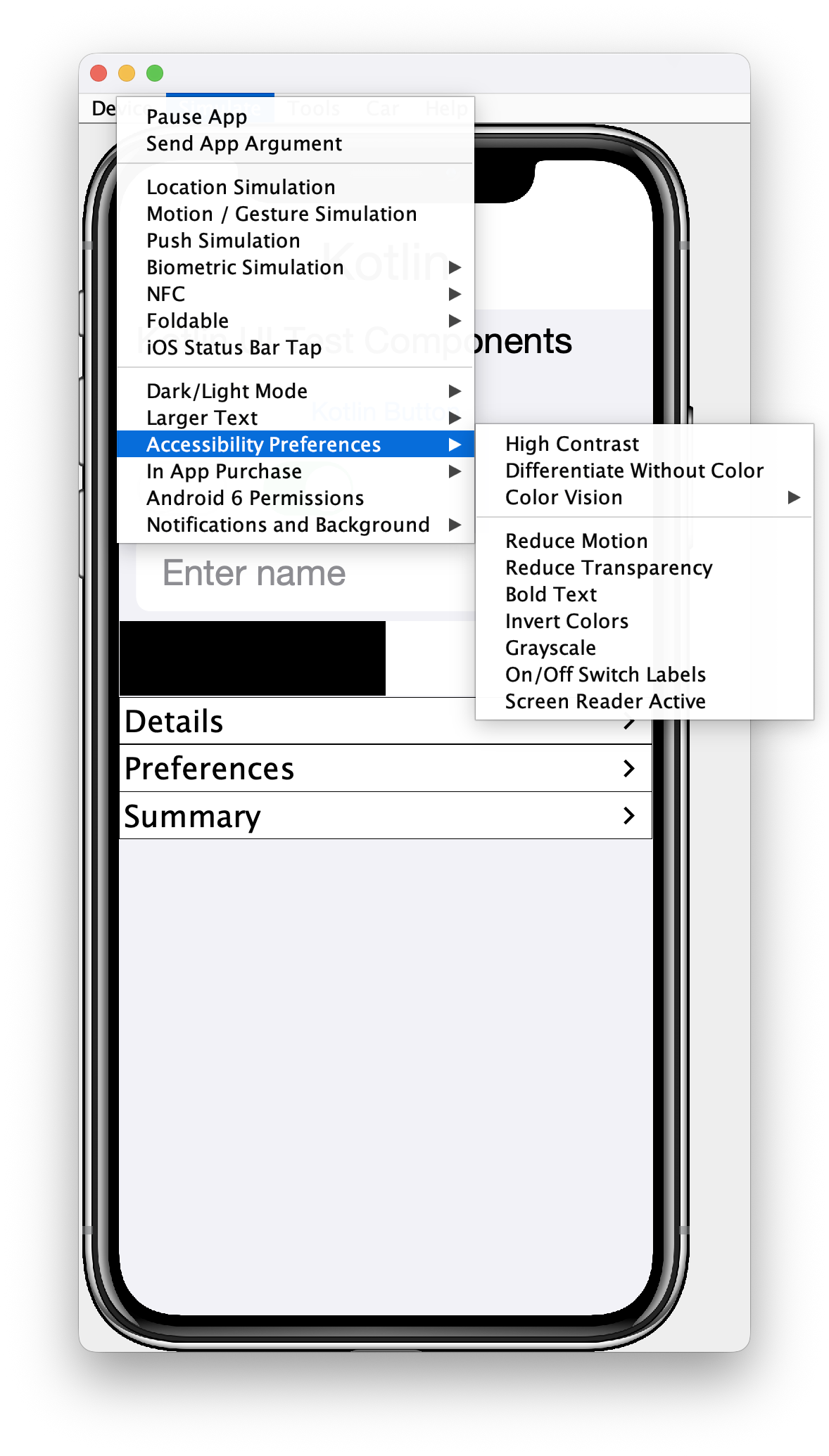
Use Simulate → Accessibility Preferences to test high contrast, reduced motion, reduced transparency, inversion, grayscale, and each color-vision filter. Also test Simulate → Larger Text at Accessibility 5. Look for clipped text, color-only state, invisible focus, unreadable overlays, and motion that remains essential to understanding the result.
Correct the component API or theme. Run the audit again, add a focused assertion, and verify the native screen reader before considering the issue closed.
The simulator menu changes the values returned by Display and CN. Color-vision, inversion, and grayscale choices also filter the simulator canvas, so screenshots show approximately what remains distinguishable. These filters are diagnostic approximations; they don’t replace testing with platform display filters or users.
The following icon-only custom control is painted and responds to a pointer, but initially has no usable name, role, or keyboard-equivalent action. The audit reports it as an unlabeled interactive node. Repair the semantic contract at the custom-control boundary:
iconOnlyButton.getSemantics()
        .setRole(AccessibilityRole.BUTTON)
        .setLabel("Delete message")
        .setHint("Removes this message from the conversation")
        .setIdentifier("message-delete")
        .addAction(new AccessibilityAction(
                AccessibilityAction.ACTIVATE,
                null,
                new AccessibilityAction.Handler() {
                    public boolean perform(Component component, Object argument) {
                        deleteMessage();
                        return true;
                    }
                }));
Don’t fix the warning by adding a label alone if the role, current state, range, or available actions are still wrong. For example, a custom switch needs SWITCH, checked state, and activation; a chart needs virtual descendants for its meaningful data points; a renderer-backed grid needs collection and item metadata.
Assertions that prevent regressions
Snapshot the finished form and assert behavior that matters to a user. Prefer stable identifiers and resolved semantics over implementation class names or platform-specific speech:
AccessibilityTreeSnapshot tree = AccessibilityInspector.snapshot(form);
AccessibilityAssertions.assertNoErrors(tree);
AccessibilityAssertions.assertNoUnlabeledInteractiveNodes(tree);

AccessibilityNodeSnapshot save = tree.getNodeByIdentifier("profile-save");
assert save.getRole() == AccessibilityRole.BUTTON;
assert save.getAction(AccessibilityAction.ACTIVATE) != null;
Keep targeted assertions for traversal order, validation errors, live-region behavior, ranges, and stable virtual keys. The scripts/hellocodenameone accessibility fixture invokes every portable preference API and exercises the resolved semantic tree on each native CI platform.
Native verification
The simulator finds portable problems, but the final pass must use VoiceOver, TalkBack, Narrator, Orca, or the browser accessibility tree. Navigate in both directions, activate every action, change adjustable values, enter and leave collections, trigger errors, and confirm that focus moves sensibly after a dialog, navigation, deletion, or live update. Record the platform, assistive-technology version, input method, and failed semantic node in the bug report; attach the inspector JSON when the native result differs from the portable snapshot.
Platform mappings
| Target | Native representation | Notable behavior |
|---|---|---|
iOS, iPadOS, and macOS |
| Traits, values, frames, custom actions, adjustable actions, live announcements, and screen/layout transitions |
Android |
| Class/role mapping, checked and mixed state, headings, pane titles, errors, ranges, collections, focus, hit testing, and custom actions |
Windows native | UI Automation fragment-root provider | Virtual fragments, control types, names, values, state, bounds, navigation, focus lookup, hit testing, and action dispatch |
Linux native | Transparent GTK semantic widgets exposed through ATK/AT-SPI | Roles, names, descriptions, state, hierarchy, bounds, and action dispatch |
Java SE simulator and desktop | Swing | Roles, states, values, geometry, accessible actions, and Component Inspector integration |
JavaScript | A synchronized off-screen DOM tree | ARIA roles, names, state, ranges, live regions, collection metadata, traversal order, and action routing; the painted canvas is hidden from the accessibility tree |
The API intentionally goes beyond a label-only model: it includes stable virtual children, explicit traversal constraints, collection spans and set metadata, pane transitions, machine-readable inspection, and built-in semantic audits. Platform accessibility tools remain the final verification step because screen readers can apply platform-specific presentation rules.
For underlying platform guidance, see the Apple UIAccessibility protocol, Android accessibility principles, Microsoft UI Automation provider overview, and W3C WAI-ARIA.