Last week I wrote about the effort of revitalizing the native themes in Codename One and I’m not sure if I got the point across as I would have liked it. So this week before I go into the changes and work we’re doing I’d like to take a step back and explain how everything works and why we need a native theme…
| To implement the features this week we made some big changes check out the section titled changes for the gist of this… |
In order to adapt an application to OS conventions Codename One loads an internal theme that matches the given OS. This is a theme we developed for every OS we support. We then load your theme on top of that theme and you can override various default behaviors.
The native theme is crucial as it defines a lot of conventions, standards & theme constants that would be hard to guess otherwise. A great example for that is the padding of the status bar on iOS which is defined in the native theme.
When we launched Codename One the latest iOS version was 4.x and apps looked very different back then. So we designed the iOS theme for that. Android 2.x just launched around then and we built the Android theme with that purpose. Both OS’s looked radically different from one another in practically every way.
Since then both Apple and Google adopted a lot of the flat design sensibilities and made their respective UI’s cleaner. We adapted the native themes to match and left it at that as changes in the UI were far more nuanced.
However, as our product matures people expect a higher standard of fidelity both from Codename One and from apps in general and we didn’t dedicate resources to address a lot of the nuances. Google has made great strides in refining their UI and UX designs and we didn’t keep up mostly expecting developers to do the design while we focus on the technology. While design is still your responsibility as a developer, we want to shorten the distance you need to go in order to create a good looking native feel.
The purpose of this segment is 3 fold:
-
Document the process
-
Inform you of upcoming changes
-
Educate you about how things “should” look
You don’t really need to do anything. Your apps will just “look better”.
With the new native themes I also hope to reduce variance between the native themes as the OS’s look far more alike today. I also hope to reduce usage of images and as a result allow deeper customization with less resources. E.g. currently in order to change the color of components we often need to define image borders but this is fixable. We should be able to colorize an app just by overriding a few elements.
Changes
In order to implement the things below we had to do a lot of changes to the core of Codename One, I’ll write more about what we did exactly next week but these are the things you need to be careful with:
-
If you are a pro user using the versioned build feature, don’t update the skins!
We had to update the resource file format to support some functionality. If you need this contact us on support and we’ll add a workaround. -
The Android style ripple effect will be on by default for buttons. You can disable it by defining the theme constant
buttonRippleBoolto false -
If you want to edit the resource file for the native Android theme you will need to compile your own resource editor (designer tool). We’ll release a plugin update to include this eventually but right now this is what we have
As I mentioned before we’ll probably do a lot of these changes in the coming months as we strive to align more closely with the native OS’s and refine our themes.
Last Time on Pixel Perfect
Last time on pixel perfect I mentioned these big ticket items for the next session:
-
Raised button UIID
-
Ripple effect
-
Round corners on Android raised button and pressed color
Lets get thru them one by one…
Raised Button
First we need to know whether a raised button exists in the theme. For this we’ve added the theme constant hasRaisedButtonBool which will return true on Android but will be false elsewhere. You can use it like this:
if(UIManager.getInstance().isThemeConstant("hasRaisedButtonBool", false)) {
    // that means we can use a raised button
}
To enable this I added a new RaisedButton UIID that derives from Button and will act like it except for the places where hasRaisedButtonBool is true in which case it will look like this:
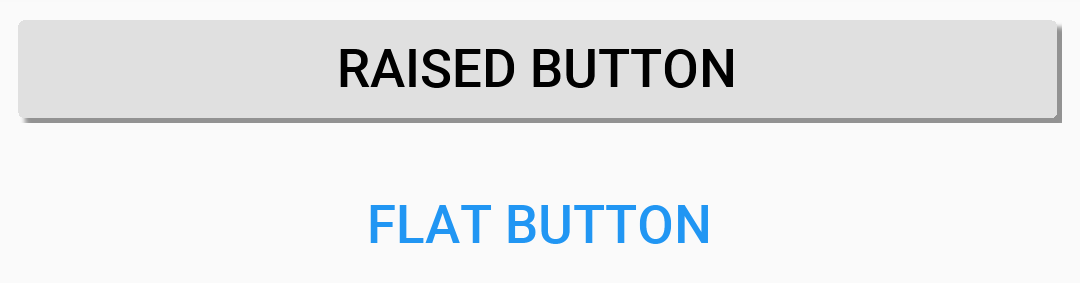
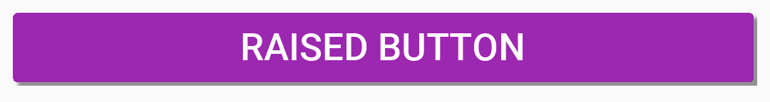
Notice that you can easily customize the colors of these buttons now since the border respects user colors…
In this case I just set the background color to purple and the foreground to white:
Form f = new Form("Pixel Perfect", BoxLayout.y());
Button b = new Button("Raised Button", "RaisedButton");
Button r = new Button("Flat Button");
f.add(b);
f.add(r);
f.show();
How does it Work?
To enable this I added a new round rect border type similar to the round border type. This will supersede the existing round rect border functionality and there is quite a bit to say about that which I will cover next week.
For now the cool thing is you can use use the system colors and things will work pretty much as you would expect…
Pressed Effect for Flat Buttons
As I mentioned above we have a new round rectangle border. It’s now used for the pressed effect in the flat buttons on Android as well as indicated here:

To generate this image I used this code:
CheckBox pressed = CheckBox.createToggle("Pressed Flat Button");
pressed.setSelected(true);
pressed.setUIID("Button");
f.add(pressed);
That’s actually really important… If you try to press a button with your finger and not via this approach you might get a different result because of the next item…
Ripple Effect
The ripple effect in material design highlights the location of the finger and grows as a circle to occupy the full area of the component as the user presses the button.
We added the ability to perform a ripple effect by darkening the touched area and growing that in a quick animation:
Ripple effect can be applied to any component but we currently only have it turned on for buttons on Android which also applies to things like title commands, side menu elements etc. This might not apply at this moment to lead components like multi-buttons but we’re getting there…
Component has a new property to enable the ripple effect setRippleEffect(boolean) and the corresponding isRippleEffect(). You can turn it on or off individually in the component level. However, Button has static setButtonRippleEffectDefault(boolean) and isButtonRippleEffectDefault(). These allow us to define the default behavior for all the buttons and that can be configured via the theme constant buttonRippleBool which is currently on by default on the native Android theme.
Moving On
To get the full changes you will also need to update your simulator skins again this Friday. Once you update them your libs must be up to date too with Update Client Libs from Codename One Settings → Basic.
After last week we got quite a bit of contacts about buttons becoming upper case all of a sudden. I understand that people don’t want to read the long blog posts or even shorter alerts explaining these updates. A huge part of the reason we are doing these changes now is the proximity to the 3.7 release so pro users can leverage versioned build effectively in case we break something big…
We are going to do a lot of changes here, we don’t want to disrupt your work but it’s essential we move Codename One forward. If there is any way we can communicate this better we are open to suggestions… Keep in mind that there will be a lot of these changes and just having a banner somewhere wouldn’t be enough.
